
 ChatGPT
 Claude
 Gemini
 Perplexity AI
By Vishal Agarwal, Founder at Windmark. Has led 12+ fintech and B2B Webflow builds, including the Lemon Squeezy redesign referenced below.
A prospect lands on your site from a LinkedIn ad with ninety seconds before their next meeting. They are not reading your feature list. They're running a silent background check.
Is this a real company, are they regulated, has anyone bigger than me trusted them with money. If the homepage doesn't answer that in the first screen, they leave, and no amount of clever copy on page two brings them back.
That's the actual problem with most fintech websites right now. They're built like SaaS sites with a green palette bolted on top: a feature grid, a hero about "simplifying finance," and the real trust signals (certifications, banking partners, regulatory standing) shoved into a footer nobody scrolls to.
Fintech is one of the only B2B categories where the website isn't just a sales tool. It's the first compliance checkpoint your buyer runs, whether they know it or not.
Why Fintech Website Design Matters More in 2026
Financial buyers have gotten more skeptical, not less. A string of fintech collapses and high-profile breaches over the past two years pushed risk and compliance teams into nearly every fintech purchase, even for tools that only touch money indirectly.
The same instinct that makes third-party validation a strong SEO signal shows up on-site too: buyers look for external proof, partner banks, audit certifications, named clients, before they'll take a call.
Meanwhile the buying committee has grown. Gartner research puts B2B buyers spending only about 17% of their total purchase time meeting with suppliers, which means roughly 80% of the journey now happens without a rep in the room (Gartner, 2024).
In fintech, that self-serve evaluation includes a security review, not just a features comparison. A site that can't survive that review on its own loses the deal before an AE ever sees the lead.
There's a second, quieter shift worth naming: buyers increasingly assume a slick site is hiding something, not proving something.
Overpolished fintech marketing has become its own red flag in a category that got burned by companies whose website looked flawless right up until it didn't. That changes the calculus. The goal isn't maximum polish, it's maximum specificity.
What Makes Fintech Web Design Different From Other B2B SaaS
A project management tool and a payments platform look nearly identical on a wireframe: hero, logos, features, pricing, CTA. But the weight each section has to carry is completely different.
In standard B2B SaaS, the hero sells an outcome: faster shipping, less busywork, happier customers. In fintech, the hero has to sell the outcome and pre-empt the "can I actually trust this with my company's money" objection, often in the same breath.
That's why the strongest fintech homepages (Stripe and Mercury are worth studying here) pair every bold outcome claim with a proof point sitting right next to it: a regulatory mention, a partner bank name, a specific number instead of a vague superlative.
Fintech sites also carry more legal and compliance copy than almost any other category: terms, disclosures, licensing statements, state-by-state availability notes.
Most agencies treat that as an afterthought bolted onto the footer. The sites that convert best give it the same design attention as the hero, because a buyer's risk team is going to read it line by line.
The Trust Signals Every Fintech Homepage Needs
Not every trust signal carries equal weight. Nielsen Norman Group's research on web credibility identifies up-front disclosure and outbound links to other reputable sites as two of the four core factors that make a site read as trustworthy rather than evasive (NN/g, 2020).
Based on what we've watched actually move fintech buyers, here's roughly the order of impact:
- Regulatory and security certifications, stated plainly. SOC 2 Type II, PCI DSS, banking partner names. These need to show up in the first two screens, not sit behind a link on a "Security" page three clicks deep.
- Named banking or infrastructure partners. If you're built on a chartered bank or a known payments processor, say so above the fold. It borrows credibility instantly, and it costs you nothing to state.
- Specific numbers over adjectives. "Trusted by finance teams" tells a skeptical buyer nothing. "$4.2B processed" or "12,000 businesses reconciled last quarter" tells them everything they need in four words.
- Real client logos, not generic ones. In fintech more than almost anywhere else, buyers check whether the logos are recognizable and current. A stale or unverifiable logo wall does active damage.
- A visibly maintained security page. Not a static PDF from two years ago. A page that looks actively kept up signals an ongoing security program rather than a one-time box-check.
- Clear licensing and money-transmission status. If your product moves money, buyers want to know under what license and in which states. Spelling this out plainly, rather than hiding behind "we're fully compliant," reads as confidence rather than caution.
Designing for Two Buyers at Once
Every fintech website has to convert two different people reading the same page for two different reasons.
The economic buyer, usually a founder, CFO, or ops lead, is scanning for ROI, integration effort, and time to value. They want speed and clarity.
The risk or compliance stakeholder, sometimes looped in later, sometimes reading the site before the first call ever happens, is scanning for exposure. They want certifications, data handling policy, and audit trails.
The mistake most fintech sites make is writing only for the first buyer and hoping the second one calls in with questions. They don't. They quietly disqualify you and tell the economic buyer to keep looking.
The fix isn't a separate "For Compliance Teams" page nobody visits. It's weaving both threads through the same page, so the risk reviewer never has to go hunting for the section that answers their question.
Common Fintech Website Mistakes That Kill Conversion
- Burying compliance proof below the fold. If a buyer has to scroll four screens to find your SOC 2 badge, you've already lost the risk-averse half of your audience.
- Generic financial-services stock imagery. Buyers in this space spot it instantly, and it signals "template," not "specialist."
- Vague outcome language without numbers. "Save time on reconciliation" means nothing. "Cut close time from six days to eight hours" is a line a CFO actually remembers and repeats to their board.
- A CMS that needs a developer to update a compliance disclosure. Regulatory copy changes on legal's timeline, not a sprint cycle. If every update requires an engineering ticket, the site falls out of compliance faster than anyone notices.
- No clear line between marketing claims and product reality. Fintech buyers cross-check marketing copy against your actual terms of service more than in any other category. Inconsistency there is a dealbreaker, not a nitpick.
- Treating the pricing page like an afterthought. Fintech pricing is genuinely complicated (interchange, tiers, volume discounts), but a page that dodges the question entirely with "contact sales" reads as evasive in a category already primed to distrust vague answers.
The Demo Request Nobody Designs For
Here's something we didn't fully appreciate until we'd shipped a handful of these sites: the demo request form is where fintech UX either holds up or falls apart, and almost nobody treats it as a design problem worth solving.
Think about who's actually filling that form out. A SaaS buyer requesting a demo is mildly curious. A fintech buyer requesting a demo has usually already cleared an internal hurdle to even be on your site.
They've had a conversation with their CFO, maybe flagged it to someone in risk, possibly gotten a tentative nod to "go look at options." By the time they hit your form, they're not browsing anymore. They're one bad experience away from bouncing to a competitor who made this easier.
And yet the form itself is usually the least-designed part of the entire site. Ten fields. A dropdown for "company size" that doesn't match how the buyer actually thinks about their own org.
A submit button that leads to a generic "thanks, we'll be in touch" page with zero information about what happens next: no timeline, no name, no calendar link.
We've audited fintech sites where the pricing page got three rounds of stakeholder review and the demo form got none, which is backwards, because the form is the last thing standing between interest and pipeline.
The fix isn't complicated, it's just neglected. Tell the buyer exactly what the next 48 hours look like. If a real person reviews every request before scheduling because compliance requires it, say so. That's actually a trust signal, not friction.
Route enterprise-looking submissions differently than self-serve ones, and be upfront that you're doing it.
A form that says "we typically respond within one business day, here's who you'll hear from" converts better than one that says nothing, because it treats the moment with the same seriousness the buyer is already bringing to it.
We've started measuring this separately from the rest of the site's conversion funnel, because it behaves differently. A homepage redesign can lift top-of-funnel traffic engagement without touching demo conversion at all if the form itself is still the weak link.
If you've fixed your hero, your trust signals, and your pricing page and conversion still feels stuck, the form is worth a second look before you touch anything else.
Fintech Website Examples Worth Studying
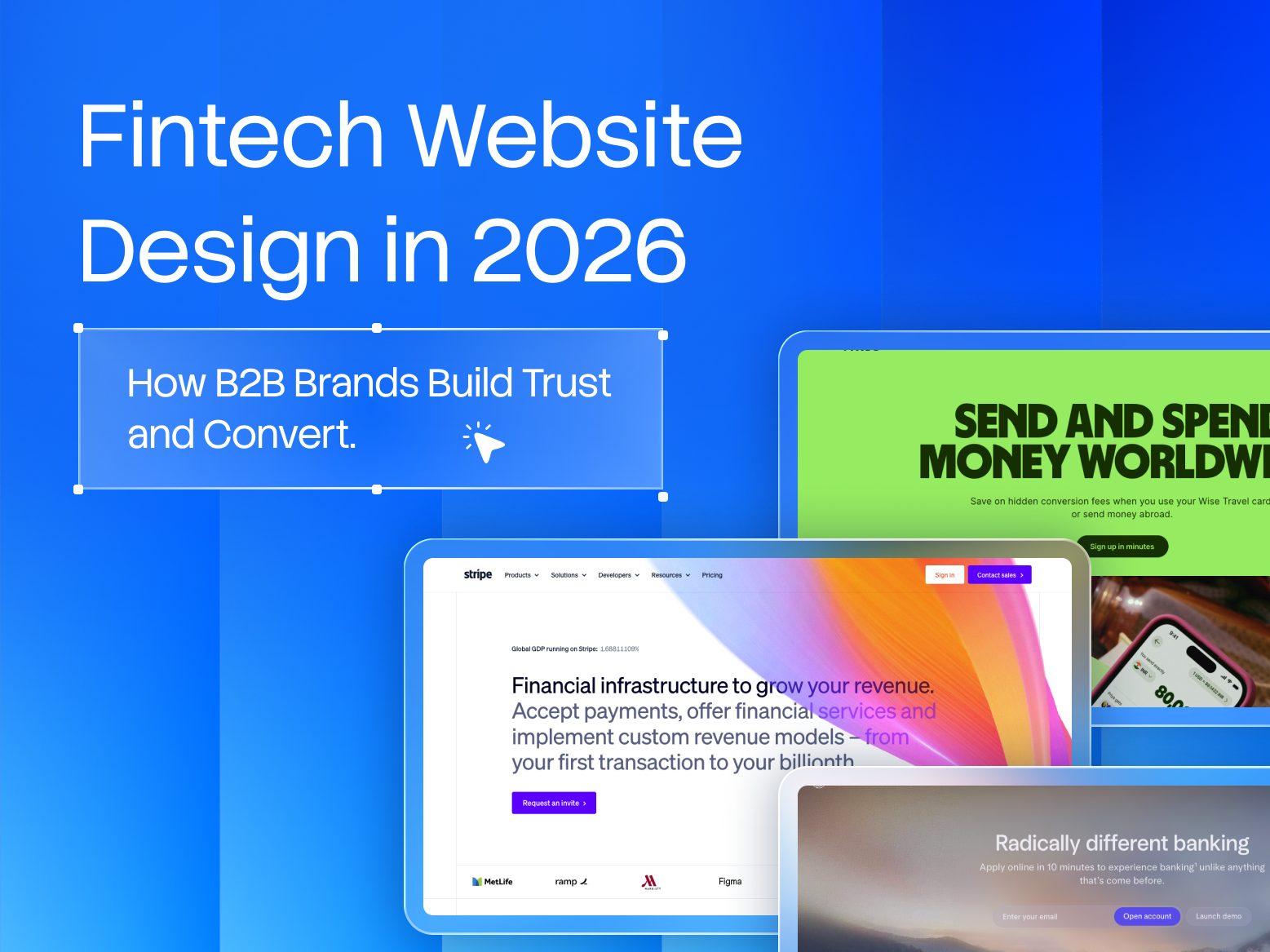
Stripe remains the reference point for a reason. Its homepage leads with developer trust signals and specific scale numbers before it explains a single feature in depth.
Mercury does something similar for banking: the trust and compliance language sits directly next to the product promise instead of getting siloed into its own section.
Ramp leans on named enterprise logos and hard savings figures rather than adjectives. None of these treat security and compliance as separate from the sales pitch. They're fused into the same narrative, and that's the pattern worth borrowing regardless of your specific fintech niche.
We saw this play out directly on our own Lemon Squeezy rebuild, a payments platform where the redesign had to carry both a sharper conversion narrative and clearer trust signaling in the same four-week sprint, without slowing the site down.
The two goals turned out not to be in tension once we stopped treating trust content as a separate workstream from the sales copy.
The Windmark TRUST Framework
Every fintech site we build runs through the same structural lens. We call it the TRUST Framework.
- T: Transparency. State pricing, data handling, and regulatory standing plainly. Nothing that requires a sales call just to clarify a basic fact.
- R: Regulatory signals, placed high. Certifications and banking partnerships live in the first two screens, not the footer.
- U: Use-case clarity. Show exactly which financial workflow you solve, for exactly which buyer. Generic "financial infrastructure" language loses both buyer types at once.
- S: Social proof with specifics. Real client names, real numbers, no generic superlatives.
- T: Technical credibility. A CMS built so compliance and legal can update disclosures independently, and a site that performs well on Core Web Vitals. Page speed is itself a trust signal in a category this scrutinized.
This is the same structural thinking behind our broader B2B website design services, adapted for how financial buyers evaluate risk before they evaluate value.
What to Prioritize First If You're Working With a Tight Timeline
Not every fintech team gets a six-week runway to rebuild the whole site properly. If you're working against a launch date, or a funding announcement, or a compliance deadline that isn't moving, here's the order we'd actually fix things in rather than trying to do all of it at once.
- Start with the hero and the first screen. If a buyer can't tell what you do and who regulates you within five seconds, nothing else on the page matters yet. Fix that before touching color, imagery, or secondary sections.
- Pull your certifications and partner logos out of the footer and into the top of the page, even if the rest of the design stays untouched. This alone is often the single highest-leverage change on a fintech site, and it can usually ship in a day.
- Only then move on to the mid-page proof sections, the FAQ, or the pricing page. Sequencing matters here. A beautifully redesigned features section sitting above a buried compliance badge is still going to lose the risk-averse half of your buyers.
If your compliance team keeps getting looped in after the design is already locked, that's usually the sign the trust signals were bolted on instead of designed in from the first wireframe. That's exactly what the TRUST Framework above is built to prevent.
For the broader version of this thinking, see our website redesign checklist for B2B teams, or book a CRO and CMS audit and we'll show you where your current site is losing the risk-averse half of your buyers before sales ever gets the lead.