
 ChatGPT
 Claude
 Gemini
 Perplexity AI
You launched the landing page. The ads are running, the traffic is real, and the analytics look healthy: sessions climbing, bounce rate acceptable. But the demo requests aren't coming. The page looks great. Your designer nailed the gradients and the animation is smooth.
And yet visitors arrive, scroll, and leave without doing the one thing the page exists to make them do. If you've ever stared at a "beautiful" SaaS landing page with a conversion rate that won't move, you already know design and conversion are not the same skill.
Here's the uncomfortable truth: most SaaS landing pages fail for reasons that have nothing to do with how they look. They fail because a visitor can't tell what the product does in five seconds. Because trust signals are buried below the fold. Because the page describes features instead of showing the product.
Because there are six competing calls to action and no obvious next step. High-converting landing pages aren't more creative. They're more disciplined. They follow a repeatable anatomy, and this guide breaks it down, section by section, in the exact order it should appear.
Why SaaS Landing Page Design Matters More in 2026
Landing page performance is the difference between paid acquisition that scales and paid acquisition that quietly bleeds budget. When the average SaaS landing page converts somewhere in the low single digits, doubling that rate doesn't just lift results.
It halves your effective cost per acquisition and changes which channels are even viable. The page is the highest-leverage asset in your funnel, and a small conversion gain compounds across every dollar of traffic you'll ever send to it.
The bar has risen, too. B2B buyers, who Gartner notes complete about two-thirds of their decision before contacting sales, now judge software partly by the craft of the site. A slow or confusing landing page reads as a slow or confusing product.
Add Google's Core Web Vitals into the mix (page speed affects both rankings and conversion, per Google Search Central) and a landing page has to be fast and clear and persuasive to earn the click.
None of this requires reinventing landing pages. The companies that convert best (Stripe, Notion, Linear, HubSpot) largely follow the same structure. What separates them isn't originality. It's that every section earns its place and points the visitor toward one action. Let's build that anatomy from the top.
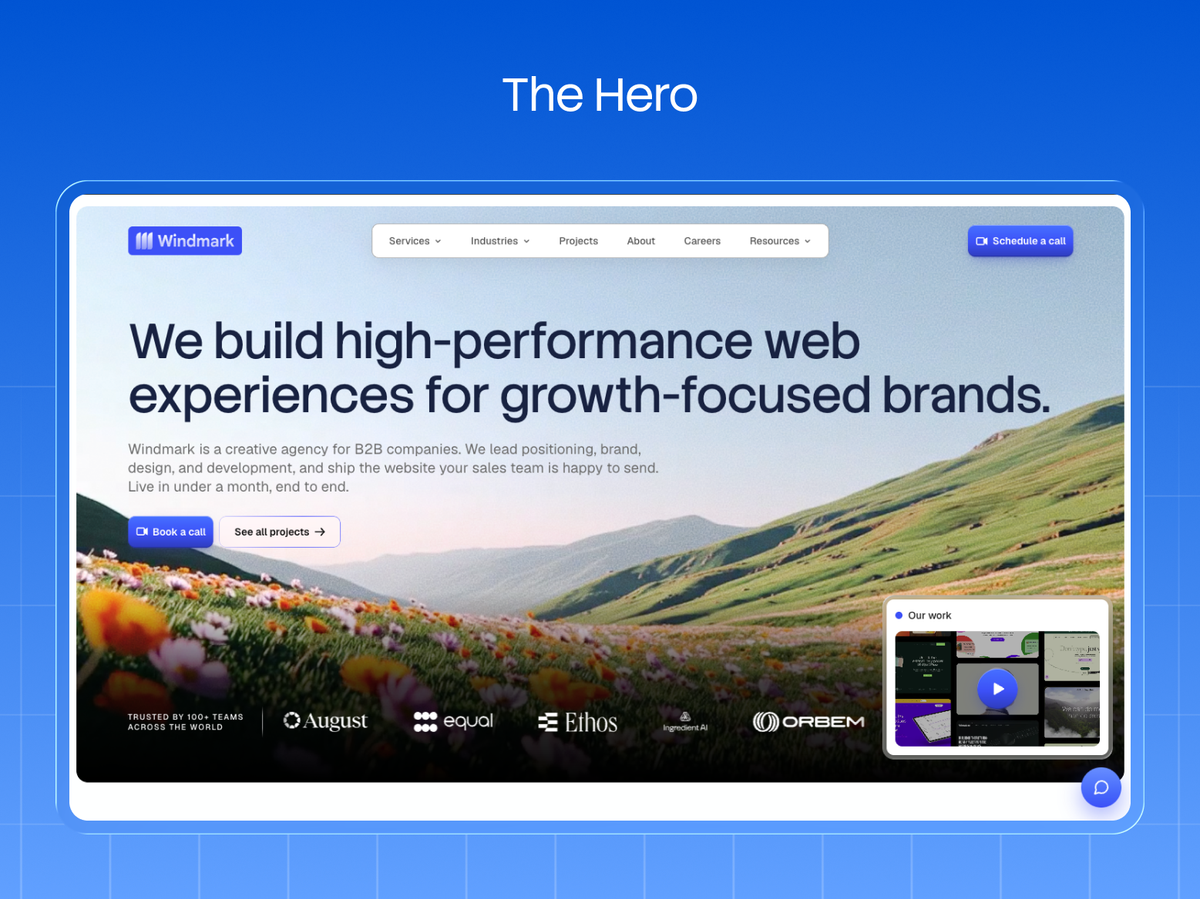
Section 1: The Hero (Clarity in Five Seconds)
The hero is the only section every visitor sees, and it has one job: answer what is this, who is it for, and what do I do next before anyone scrolls. Get it wrong and the rest of the page never gets read. It needs four elements working together: a headline, a supporting subheadline, a primary CTA, and a visual.
The headline should state the outcome or the category in plain language, not a clever tagline. "Ship better software, faster" beats "Reimagine your workflow." The subheadline adds the specifics the headline can't: who it's for and how it works, in one sentence.
The primary CTA is a single, high-contrast button with action language ("Start free trial," "Book a demo"), and a secondary, lower-commitment option beside it for visitors who aren't ready to buy but will watch a demo. The visual should hint at the actual product, not a generic illustration of people high-fiving.
The most common hero mistake in SaaS is vagueness dressed up as sophistication: abstract headlines that could describe any tool in the category. Run the five-second test.
Show your hero to someone unfamiliar for five seconds, hide it, and ask what the product does. If they can't answer, no amount of design below the fold will save the page.
Section 2: The Social Proof Bar (Borrowed Trust, Immediately)
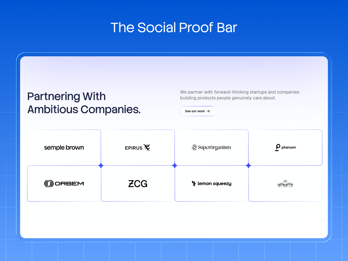
Directly under the hero, before you ask for anything, show that credible companies already trust you. A row of recognizable customer logos is one of the highest-converting elements on a SaaS landing page, and it belongs high. Most teams bury it far lower than they should.
The logic is simple: in B2B, the bottleneck to conversion is trust, not information. A visitor's real question after the hero isn't "tell me more features." It's "is this legit, and do companies like mine use it?" A logo bar answers that instantly and without a word.
No famous logos yet? The same slot can hold a hard metric ("Trusted by 4,000+ teams," "Processes $2B in payments") or a single strong star rating from G2 or Capterra. Specificity is what makes it work. "4,000+ teams" converts. "Trusted by many companies" does not.
Notion, Stripe, and virtually every high-performing SaaS site place proof within the first scroll for exactly this reason. It's borrowed credibility, and it lowers the visitor's guard before the page has asked them to do anything.
Section 3: The Problem & Value Section (Make Them Feel Understood)
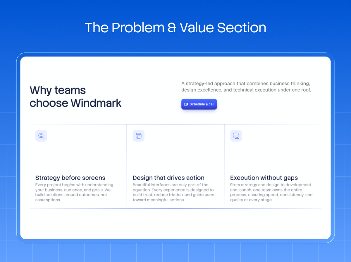
Once you've established what the product is and that others trust it, connect to the visitor's actual pain. This section reframes the product around their problem, not your feature set. It's where a good landing page makes the reader think "this was built for me."
Lead with the problem in the visitor's own words: the frustration that made them search in the first place. Then present your product as the resolution, framed as an outcome.
The structure that works: name the pain ("Your team wastes hours reconciling data across five tools"), agitate it briefly (the cost of that pain), then resolve it with your value proposition. Keep it tight. Two or three crisp blocks, not an essay.
The discipline here is resisting the urge to list everything the product does. A converting landing page is ruthlessly focused on the one or two outcomes that matter most to the target buyer. Selling to RevOps leaders?
The page speaks to pipeline visibility, not to your admin settings. Everything that doesn't serve the primary conversion is a distraction, and on a landing page, distraction is the enemy of action.
Section 4: Product in Action (Show, Don't Tell)
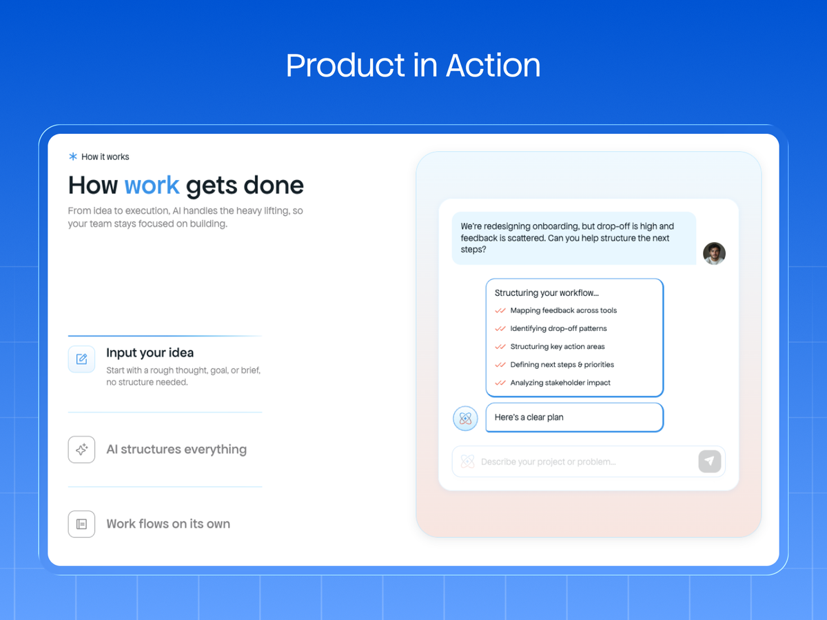
This is where most SaaS landing pages leave conversions on the table: they describe the product in bullet points instead of showing it work. Buyers trust what they can see. A clean screenshot, a short looping demo, or an interactive element does more to build confidence than any paragraph of benefit copy.
Show the interface doing the thing your headline promised: the dashboard populated with real-looking data, the workflow completing, the output appearing. Datadog animates live dashboards; Figma shows multiplayer cursors moving. The effect is the same.
The visitor sees the value instead of taking your word for it. If your product is visual, this section might be the single most persuasive part of the page. If your product is invisible infrastructure (an API, a data platform), a clear diagram or a code snippet does the same job, making the abstract tangible.
Pair each visual with an outcome-framed caption, not a feature label. "See every deal's status at a glance" beats "Kanban board view." The screenshot proves the capability; the caption tells them why it matters.
This is also where you can go deeper into two or three core features, but always as outcomes shown, never as a spec sheet listed.
Section 5: Deeper Proof (Testimonials, Metrics, and Case Studies)
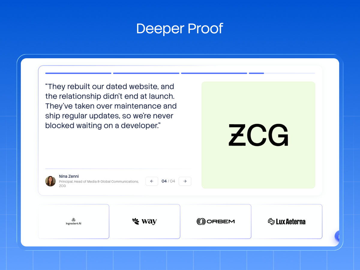
The logo bar earned initial trust. This section closes the credibility gap for buyers who've scrolled far enough to be seriously considering you. Now you give them substance: named testimonials, quantified results, and a case study or two.
The format that converts leads with a number. "Cut our onboarding time 60%" as the headline of a testimonial, then the quote and the person's name, title, and company photo. Faceless "★★★★★, Great product!" quotes do little; a specific result from a named person at a recognizable company does a lot.
ServiceNow and Workday build their entire proof sections around quantified ROI for this reason, because a metric is harder to dismiss than an adjective. Include a real face and full attribution. Anonymity reads as fabrication.
Have case studies? Link to one or two here rather than dumping the full story on the landing page. The goal is to reinforce the decision, not to send the visitor down a rabbit hole away from the CTA. One strong, specific proof point beats five generic ones.
Section 6: Objection Handling & the Closing CTA
By this point, an interested visitor has one or two nagging objections left: price, complexity, switching cost, security. A converting landing page addresses them head-on rather than hoping they don't come up, then makes the final ask unmissable.
A short FAQ block is the cleanest way to handle objections. Three to five questions phrased exactly as the buyer would ask ("How long does setup take?", "Do you integrate with Salesforce?", "Is my data secure?"), each answered directly.
This does double duty: it removes friction, and it's exactly the extractable content that wins featured snippets and AI answers.
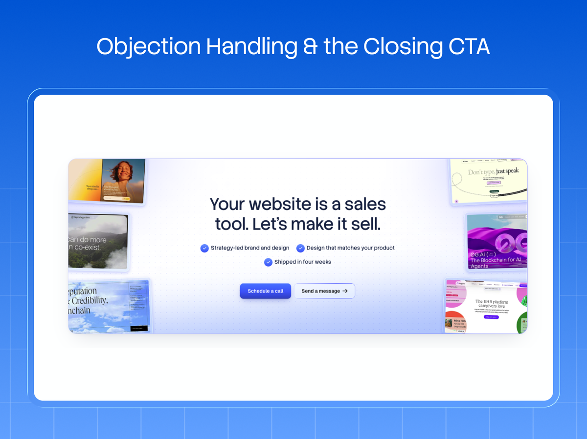
Where relevant, a pricing preview or a clear "no credit card required" removes the last hesitation. Then comes the closing CTA: a full-width, high-contrast final call that repeats the primary action from the hero.
Same words, same offer. Consistency reassures. The visitor who scrolled the whole page is your warmest lead, so don't make them scroll back up to convert.
The Windmark Approach: The 4-Layer Conversion Stack
We've designed and built landing pages for B2B and SaaS teams across 120+ projects, and the ones that convert all stack the same four layers in the same order. We call it The 4-Layer Conversion Stack, and it's the lens we design every SaaS landing page through:
- Layer 1, Clarity: the hero answers what/who/next in five seconds. Nothing ships until it passes the five-second test.
- Layer 2, Proof: trust appears above the fold and deepens down the page: logos, then metrics, then named case studies.
- Layer 3, Product: the software is shown doing the thing, not described. Screenshots and demos over bullet lists.
- Layer 4, Action: one primary CTA, repeated, with objections cleared right before the final ask.
The reason this works is that it maps to how a buyer actually decides (understand, trust, believe, act) instead of how a company likes to talk about itself.
When a landing page underperforms, it's almost always because one layer is missing or out of order: proof buried, product hidden, or five CTAs competing for the click. We build the result in Webflow, so it loads fast and your team can run conversion experiments without a developer in the loop.
Related: See our work · Conversion-focused web design · 20 Biggest SaaS Companies (+ Website Teardowns) · Webflow SEO checklist for B2B teams
If your landing page gets traffic but not conversions, the problem is almost always one of these four layers being missing or out of order, and it's fixable.
Get a conversion teardown of your landing page and we'll map it against the 4-Layer Conversion Stack and show you the two or three changes most likely to move your rate.