
 ChatGPT
 Claude
 Gemini
 Perplexity AI
Studying the biggest SaaS companies' websites teaches you more about what actually converts than any theory-heavy CRO guide ever will. These are companies that A/B test their homepage more times in a quarter than most startups redesign in a decade.
Every headline, every CTA color, every logo placement has survived data most teams will never have. When you tear down a Salesforce or a Stripe, you're not admiring the design. You're reverse-engineering millions of dollars of optimization.
The catch is that most "biggest SaaS companies" listicles stop at a revenue table, a ranked list of names and numbers you could find on any earnings page. That's not useful to a marketing leader trying to build a site that competes.
So we did it differently. Below are 20 of the biggest SaaS companies in 2026, ranked by scale, and for each one, a short website teardown: the single most stealable move on their site. Read it as a swipe file, not a leaderboard.
Why the Biggest SaaS Companies' Websites Matter in 2026
The SaaS market crossed a scale that's hard to overstate. Gartner projects worldwide end-user spending on SaaS to sail past $300 billion in 2026, making it the largest and fastest-growing slice of cloud.
The companies at the top didn't just build great products; they built websites that convert enterprise buyers who, per Gartner, complete two-thirds of their decision before ever talking to a salesperson. For those buyers, the website is the pitch.
That's why these sites are worth studying regardless of your size. The biggest SaaS companies have run the experiment for you, spending years and fortunes discovering what makes a B2B software visitor trust, understand, and click.
The specific tactics scale down surprisingly well. A startup landing page and a Salesforce homepage answer the same three questions in the same order: what is this, why should I trust it, and what do I do next? The difference is discipline, not budget.
One note on the ranking: figures below are approximate annual revenue or run-rate based on the latest public filings and reliable estimates, and the SaaS-versus-cloud line is fuzzy for the giants. Treat the order as directional. The teardowns are the point.
The 20 Biggest SaaS Companies in 2026, and What Their Websites Get Right
1. Salesforce (~$38B revenue)
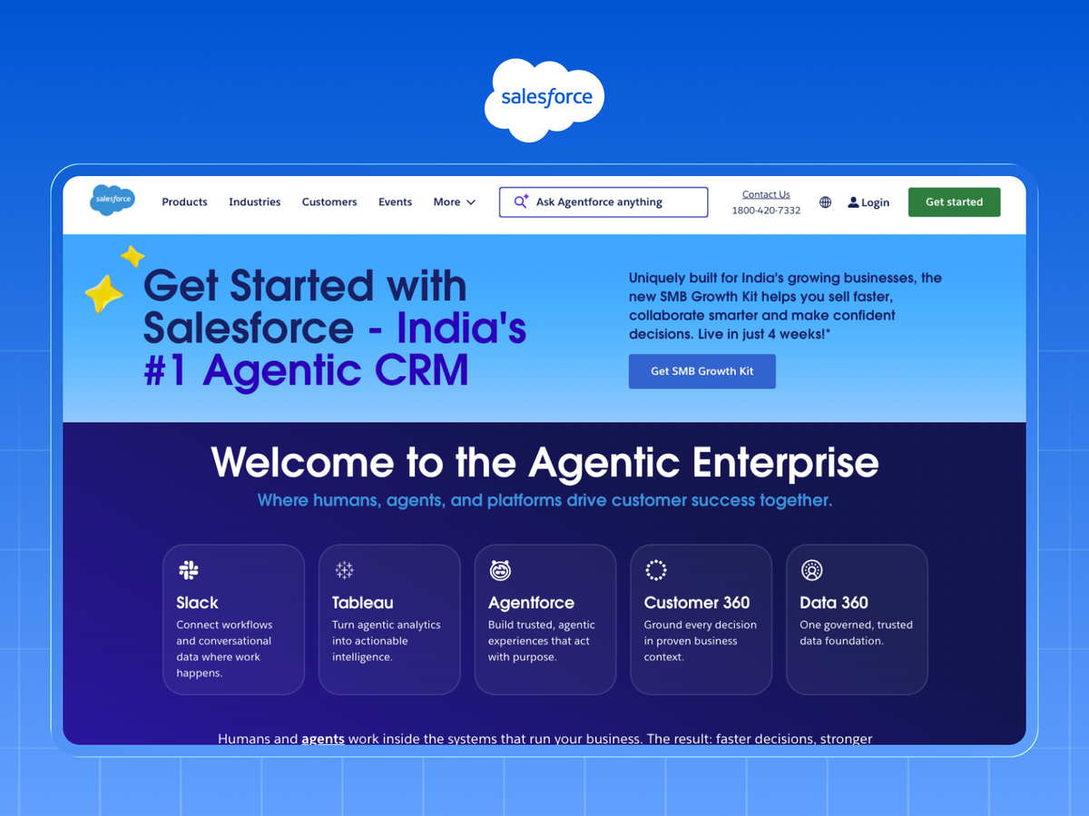
The original cloud CRM and still the largest pure-play SaaS company, spanning sales, service, marketing, and its Data Cloud and AI push.
Website teardown: Salesforce leads with an outcome, not a feature. The hero sells "the #1 AI CRM" and a business result, then immediately offers two paths ("Watch demo" and "Try for free") for different buyer readiness. Copy this: give visitors a low-commitment and a high-intent CTA side by side instead of forcing one.
2. Oracle (~$53B, cloud & SaaS)
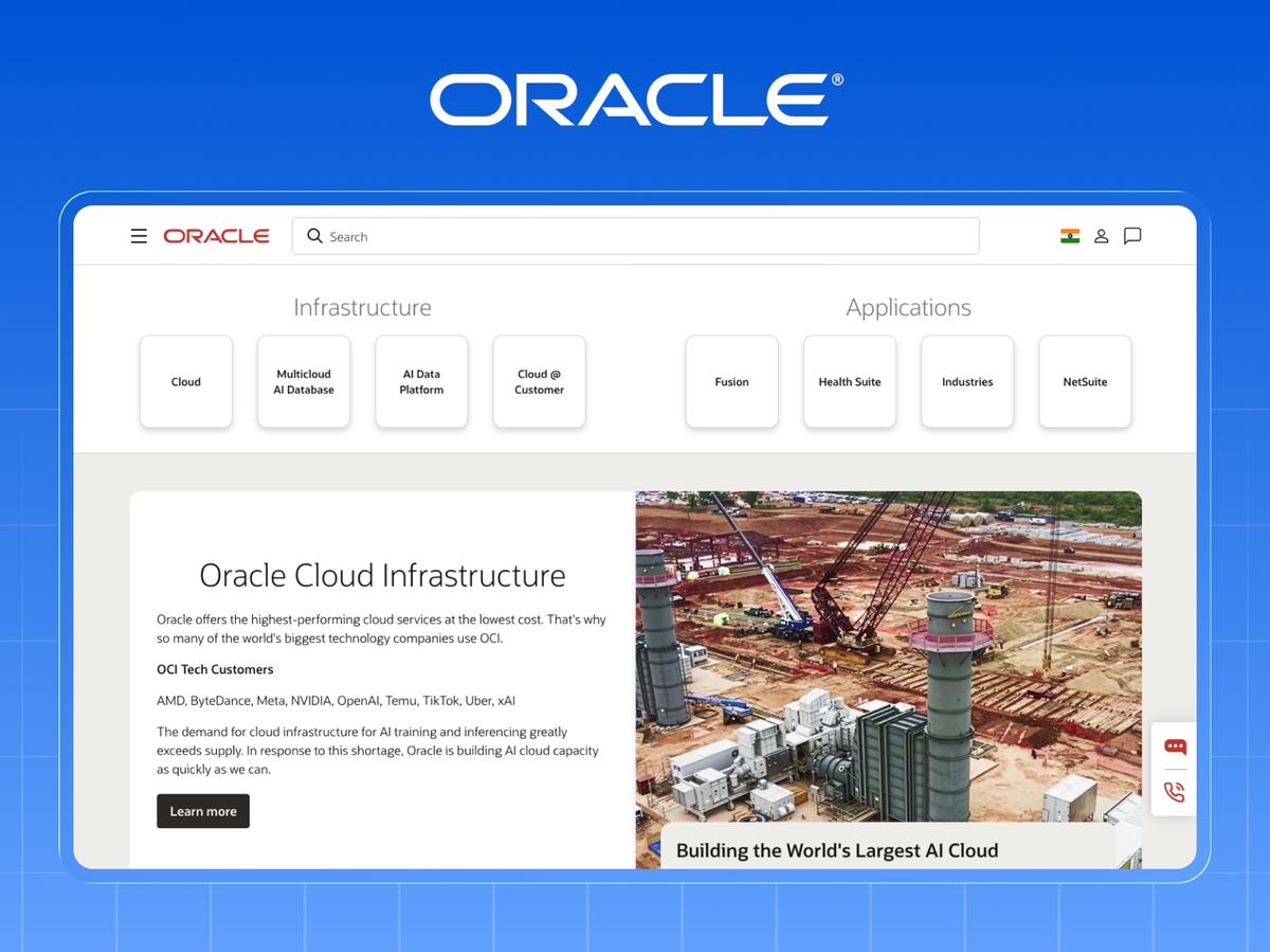
The database giant now earns a huge share from cloud applications (Fusion, NetSuite) and infrastructure.
Website teardown: Oracle uses aggressive, specific comparison claims ("cheaper than AWS") right on landing pages. The lesson isn't to bash competitors. It's that specificity ("50% lower") out-converts vague superiority ("best value") every time.
3. SAP (~$34B, cloud accelerating)
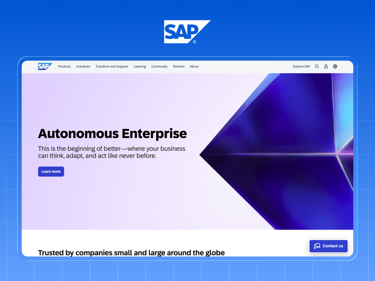
The enterprise resource planning leader, rapidly shifting revenue to cloud with S/4HANA and its business AI suite.
Website teardown: SAP segments its entire site by role and industry from the first click. For complex products, this beats a generic homepage. Send a CFO and an IT lead down different paths so each sees their problem, not a feature dump.
4. Adobe (~$21B, Digital Media & Experience)
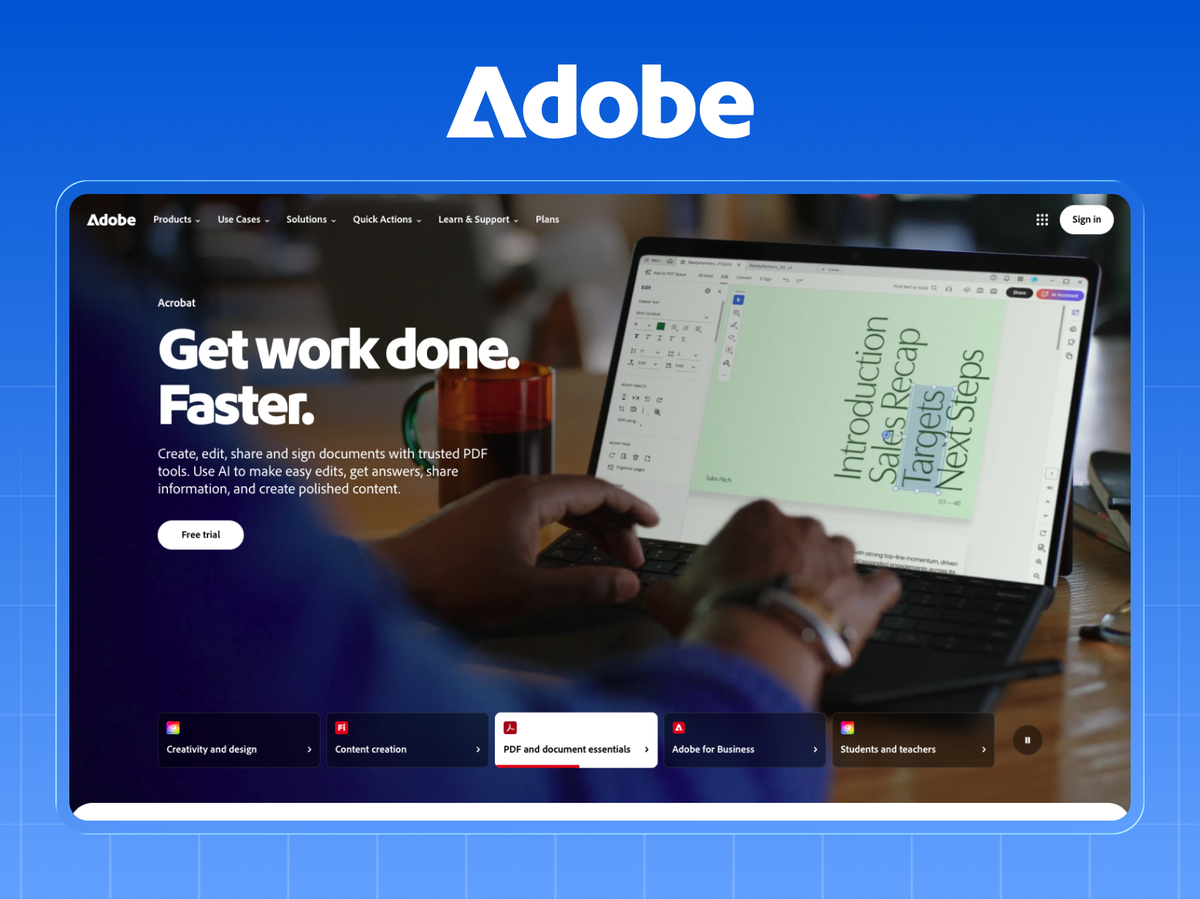
Creative Cloud, Document Cloud, and Experience Cloud: one of the most successful subscription pivots in software history.
Website teardown: Adobe shows the product doing the thing within the first scroll, with live-feeling visuals of the software in use. For any SaaS, a real product frame beats an abstract illustration. Buyers want to see it work.
5. ServiceNow (~$11B ARR)
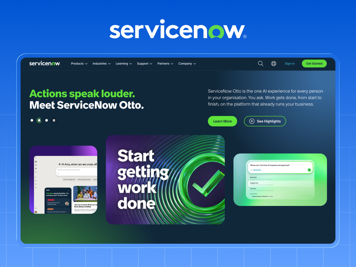
The workflow-automation platform that quietly became one of enterprise software's biggest success stories.
Website teardown: ServiceNow anchors everything to quantified ROI ("$X saved," "Y% faster"). Their case studies lead with a number, not a narrative. Steal the format: headline the metric, then tell the story.
6. Intuit (~$16B)
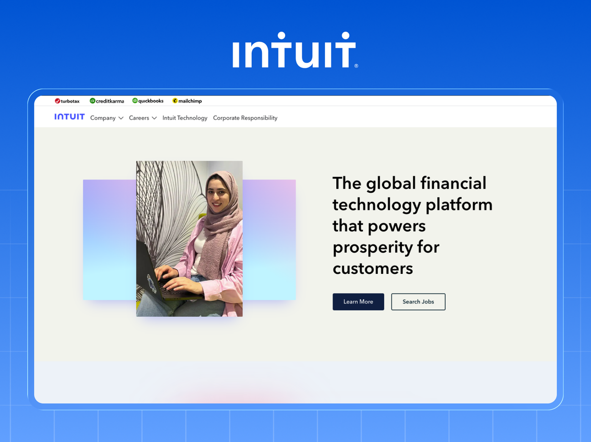
QuickBooks, TurboTax, Credit Karma, and Mailchimp: a SaaS portfolio serving small businesses and consumers.
Website teardown: Intuit's product sites are ruthlessly simple and benefit-led ("Get every dollar you deserve"). Complex financial products, plain-English promises. Clarity beats cleverness when the stakes feel high.
7. Shopify (~$8.9B)
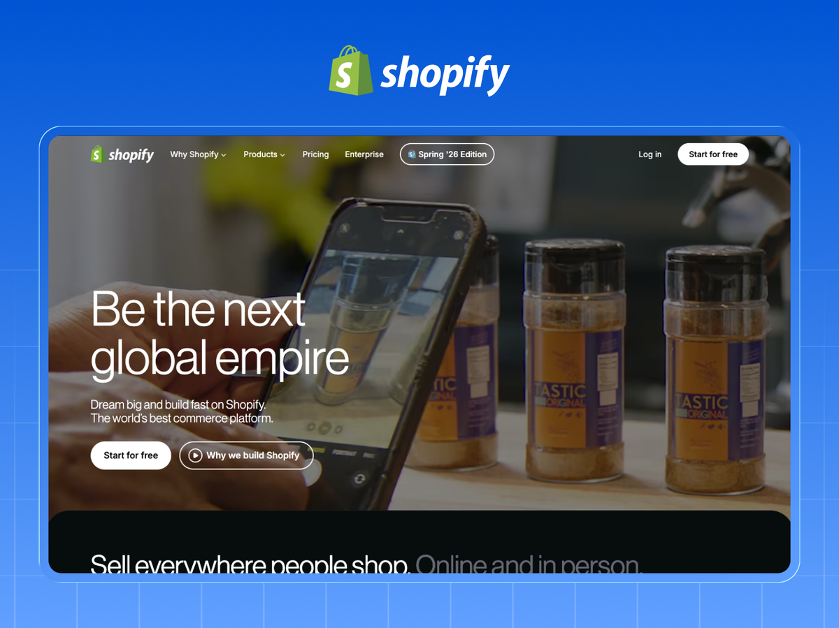
The commerce platform powering millions of merchants, from side hustles to enterprise brands.
Website teardown: Shopify's homepage is famous for one-line clarity and a single dominant CTA ("Start free trial") repeated down the page. When you have one primary action, commit to it. Don't dilute with five competing buttons.
8. Workday (~$8B)
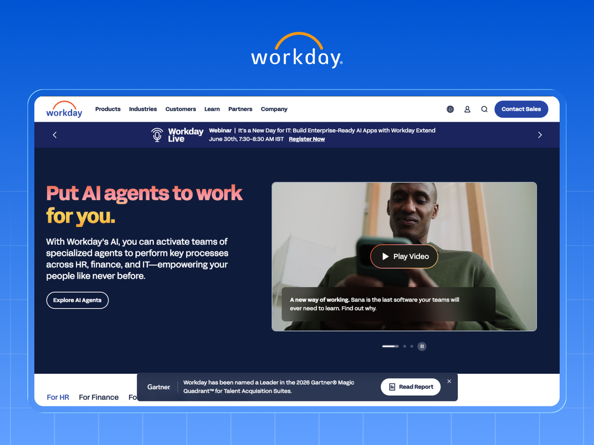
Cloud HR and finance for the enterprise, known for a loyal customer base and high retention.
Website teardown: Workday leans hard on peer proof, with logos of recognizable enterprises above the fold. For B2B, a wall of trusted logos is often the highest-converting element on the page. Put yours higher than you think.
9. Atlassian (~$4.4B)
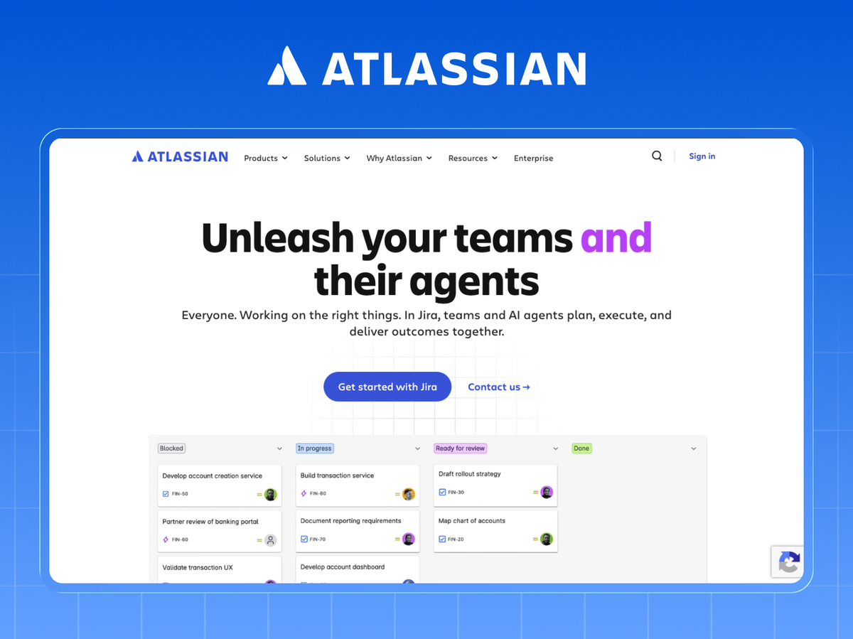
Jira, Confluence, and Trello: the collaboration backbone for software and IT teams, built on a low-touch, product-led model.
Website teardown: Atlassian's site is engineered for self-serve. Pricing is transparent and the path to "get started" is frictionless. If your model is product-led, hiding pricing behind "contact sales" kills momentum. Show it.
10. Snowflake (~$3.6B)
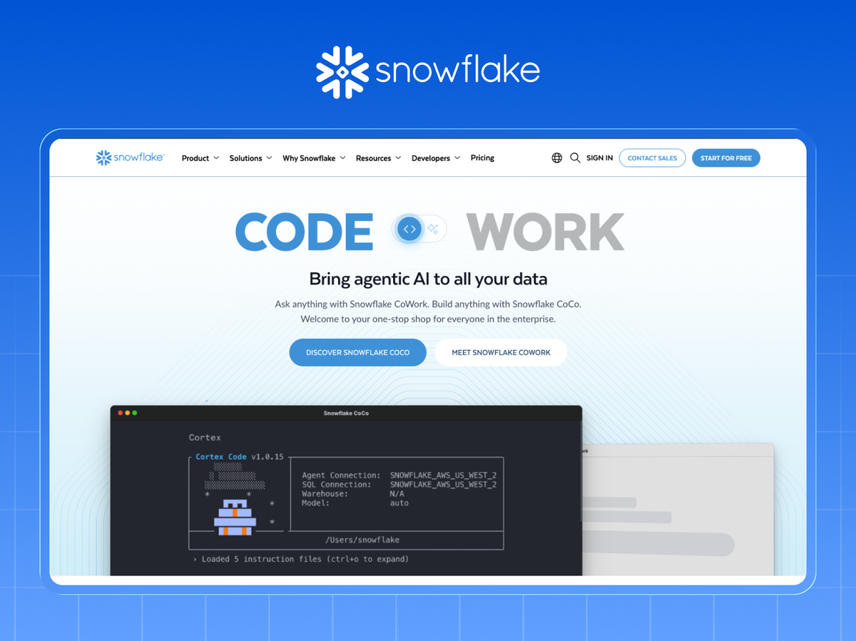
The data-cloud platform that redefined analytics infrastructure and posted one of software's biggest IPOs.
Website teardown: Snowflake makes an abstract product tangible with strong diagrams and a crisp category story ("the AI Data Cloud"). When your product is invisible infrastructure, a clear visual model does the explaining words can't.
11. CrowdStrike (~$3.4B)
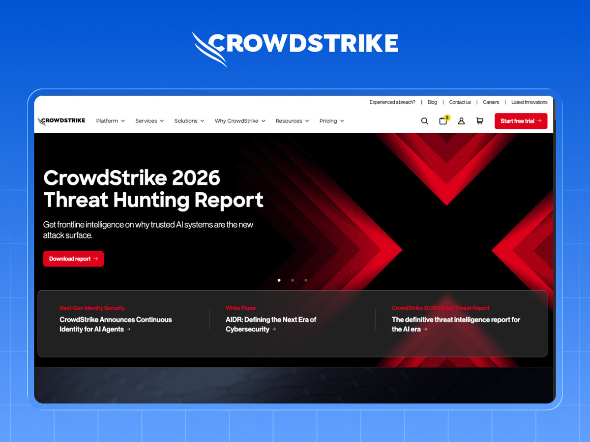
The cloud-native cybersecurity leader whose Falcon platform sets the pace in endpoint protection.
Website teardown: CrowdStrike sells urgency and authority, with analyst rankings (Gartner Magic Quadrant leader) sitting prominently on the homepage. Third-party validation is trust you can't manufacture in your own copy. Feature it loudly.
12. Datadog (~$2.7B)
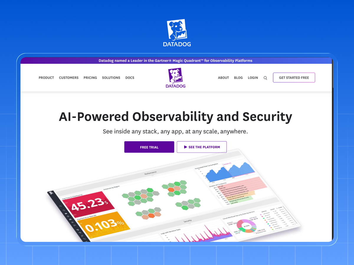
Observability and monitoring for cloud applications, beloved by engineering teams.
Website teardown: Datadog's homepage animates real dashboards, so the product's own polish becomes the marketing. If your UI is a strength, don't describe it. Show live-feeling screenshots front and center.
13. HubSpot (~$2.6B)
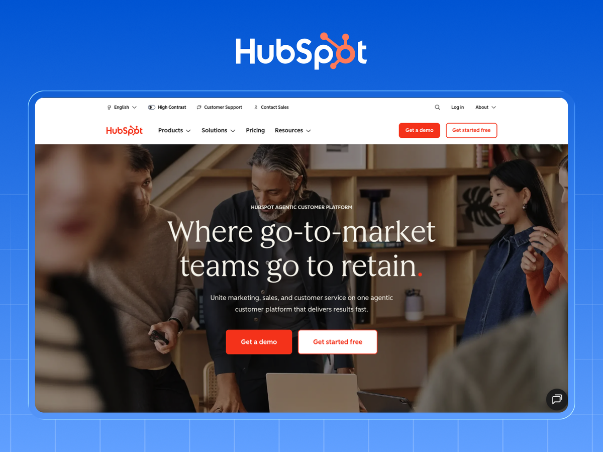
The inbound marketing pioneer, now a full CRM platform for scaling companies.
Website teardown: HubSpot's site is a masterclass in the free-tool funnel: free CRM, free tools, free courses feeding the paid product. The lesson: a genuinely useful free offer converts better than any clever headline.
14. Zoom (~$4.7B)
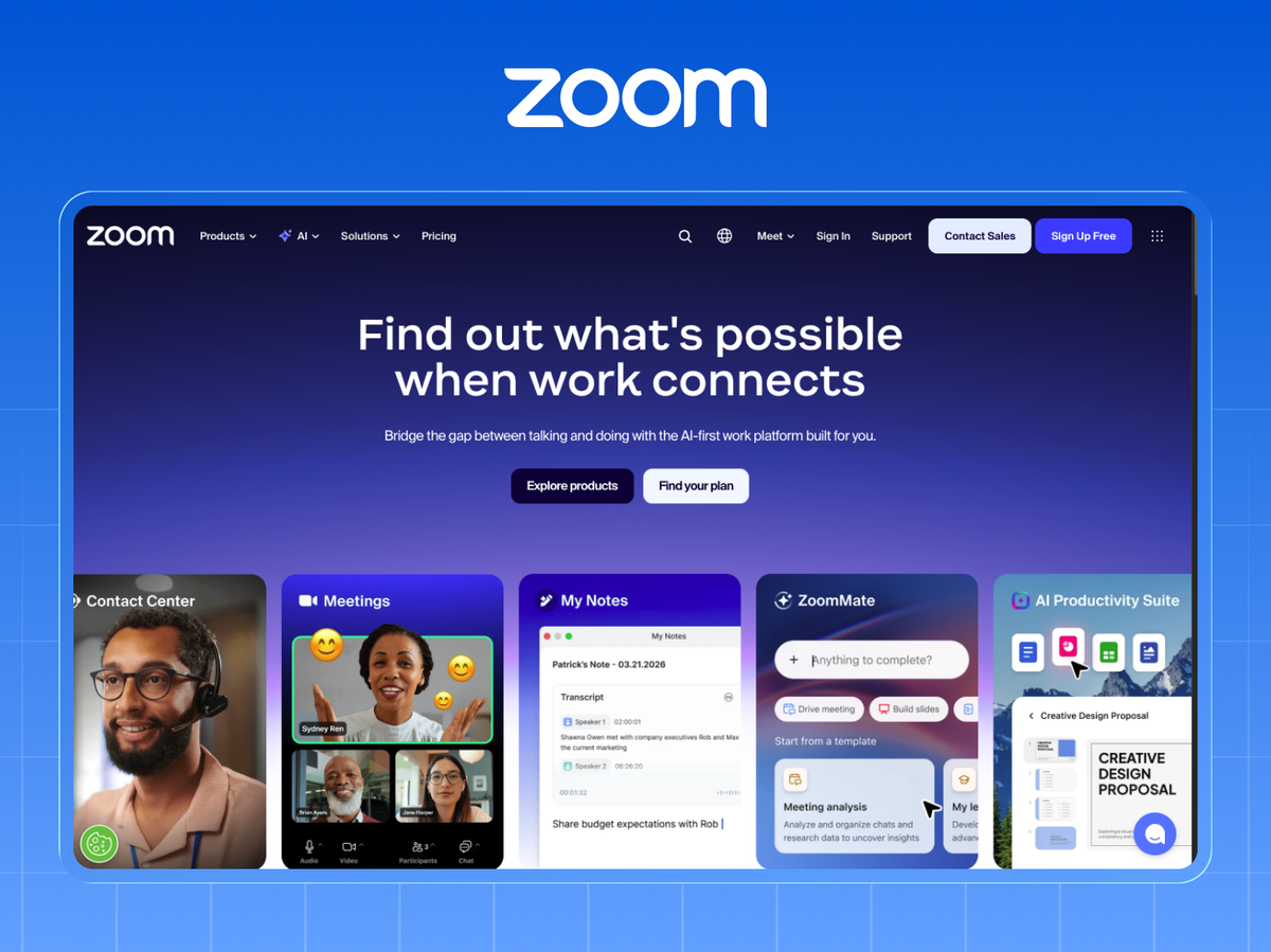
The video platform that became a verb, now expanding into a broader work suite.
Website teardown: Zoom's homepage removes friction to near zero. The primary action is one click and no credit card. Every field you remove from the path to value lifts conversion, so audit yours for anything you can cut.
15. Twilio (~$4.5B)
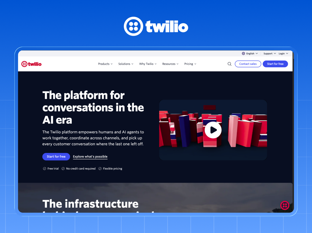
The communications API platform developers use to build messaging, voice, and email into their apps.
Website teardown: Twilio speaks directly to developers with code snippets on the homepage. Knowing exactly who clicks, and writing for them rather than a generic "everyone," is why it converts. Write for one buyer, not all of them.
16. Monday.com (~$1B)
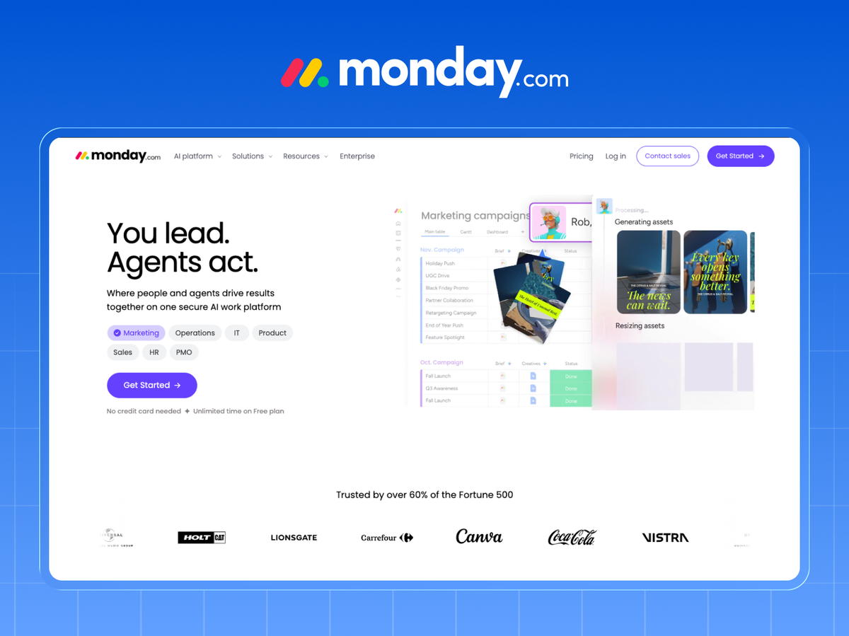
The colorful work-management platform that rode product-led growth to a billion in revenue.
Website teardown: Monday uses bold color and motion to make a spreadsheet-adjacent product feel energetic and human. In a sea of blue B2B sites, a distinctive visual identity is a conversion asset, not just branding.
17. Stripe (private, ~$1T+ processed)
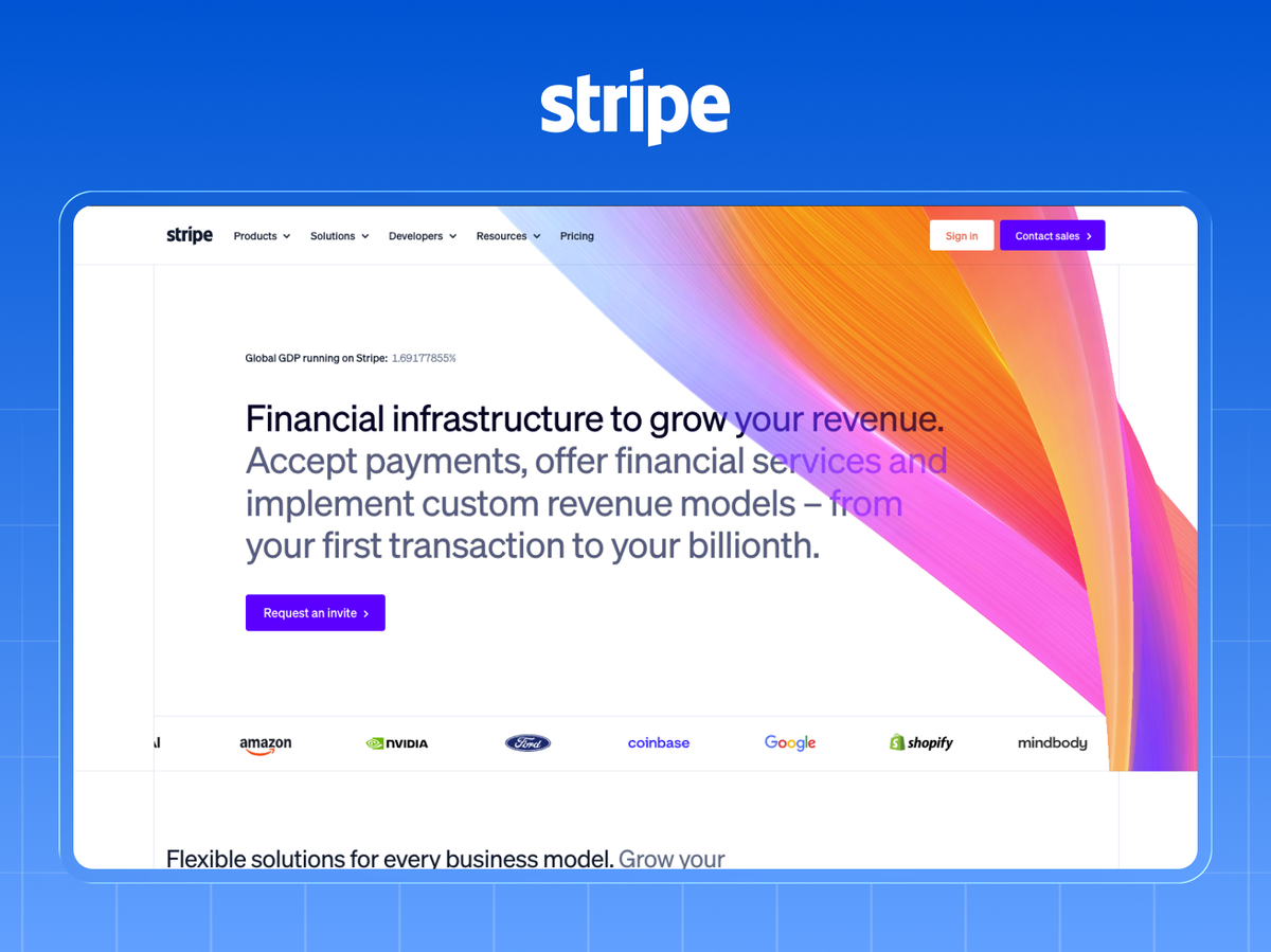
The payments infrastructure behind a huge share of internet commerce, and a design benchmark for the whole industry.
Website teardown: Stripe is the gold standard for developer-brand craft: flawless typography, subtle motion, and docs treated as a first-class product. The takeaway: buyers infer product quality from site quality. Sloppy site, sloppy product (in their mind).
18. Canva (private, ~$3B)
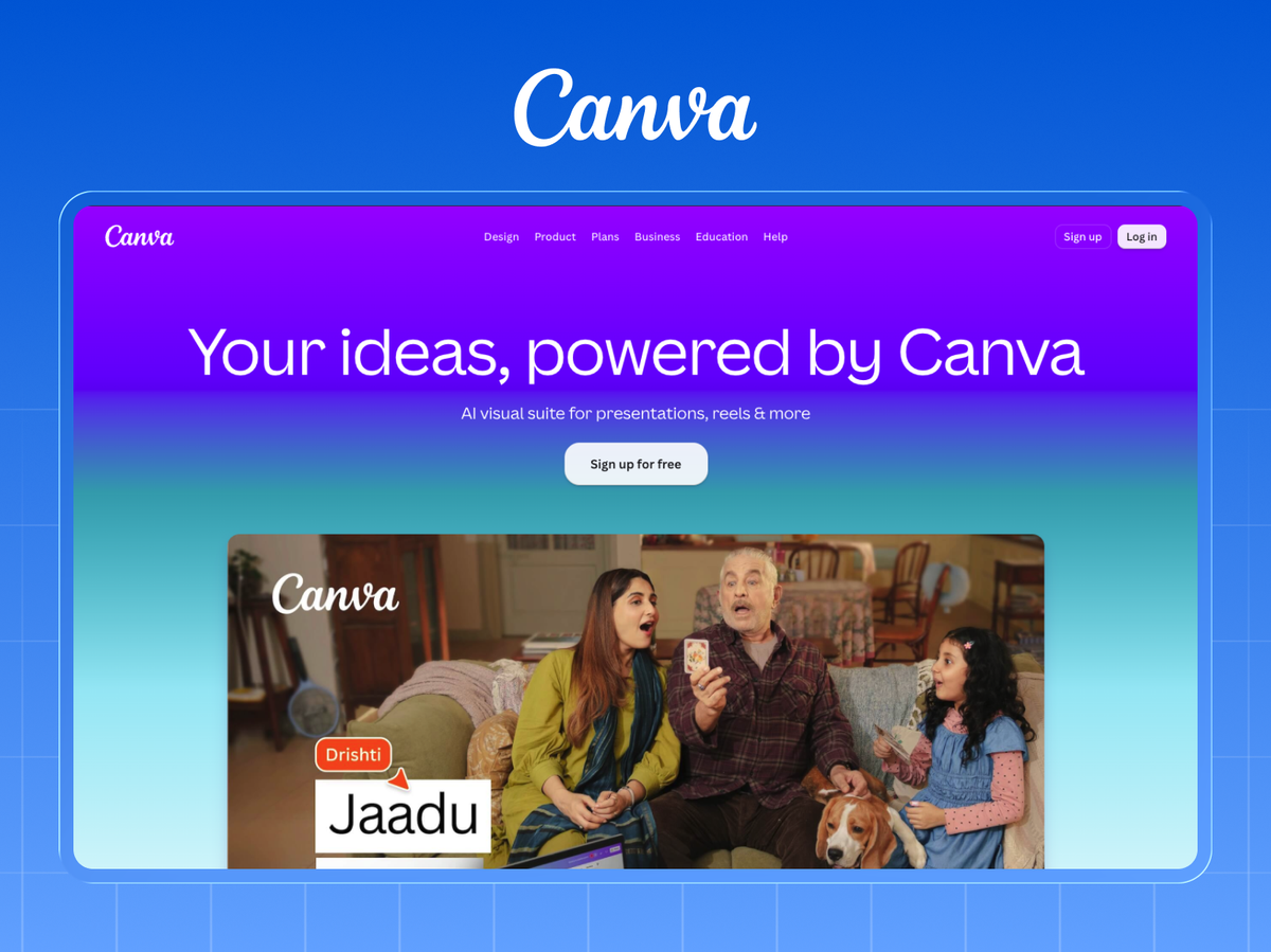
The design platform that made graphic design accessible to hundreds of millions of non-designers.
Website teardown: Canva's homepage lets you start creating immediately, embedding the product in the site. Where possible, let visitors touch the value before signup. An interactive taste beats a described benefit.
19. Notion (private, ~$400M+ run-rate)
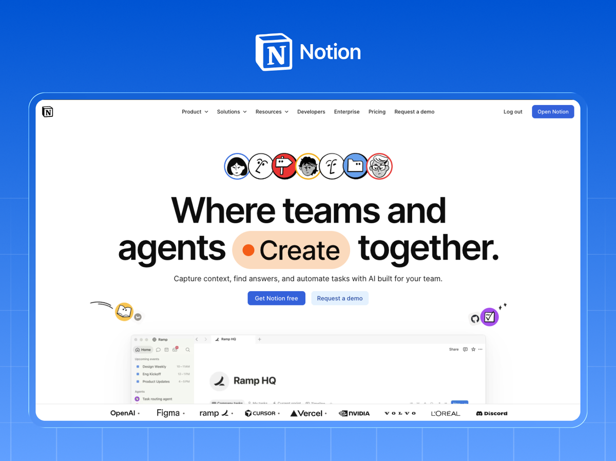
The all-in-one workspace that built a cult following through flexibility and community.
Website teardown: Notion leans on community and templates as social proof and as an onboarding on-ramp. A library of real use cases answers "but how would I use this?", the question that stalls flexible products.
20. Figma (~$700M+ run-rate)
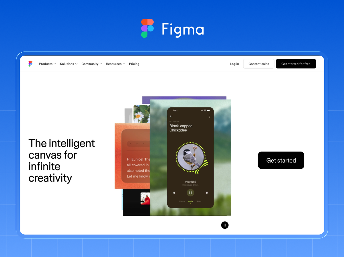
The collaborative design platform that became the industry default and reshaped how product teams work.
Website teardown: Figma's site demonstrates multiplayer collaboration visually: you see cursors and teamwork, not bullet points about it. Show your core differentiator in motion. A feeling converts better than a feature list.
What the Best SaaS Websites Have in Common
Tear down twenty of the biggest SaaS companies and the same handful of moves surface again and again, which is exactly why they're worth copying.
- A one-line value proposition above the fold that says what the product does and who it's for, in plain language, before any scroll.
- Proof within the first screen (recognizable logos, an analyst ranking, or a hard metric), because trust is the real bottleneck in B2B.
- The product shown in action early, as real UI or interactive demo, not abstract illustration.
- A clear primary CTA repeated down the page, with a secondary low-commitment option for browsers who aren't ready.
The other shared trait is invisible but decisive: speed. These sites are fast, because the giants know Core Web Vitals affect both rankings and conversion (Google Search Central has published the correlation for years). A beautiful site that loads slowly loses to a plain one that loads instantly.
And none of these lessons requires an enterprise budget. A headline, a logo bar, a product screenshot, and a fast page are within reach of any team. The gap between your site and theirs is rarely money. It's discipline and the right build.
The Windmark Approach: The Teardown Lens
We tear down SaaS sites for a living. It's how every Windmark build starts. Before we design anything, we run a client's site (and their top competitors') through what we call The Teardown Lens, the same five checks we'd apply to any company on this list:
- Message: Can a stranger tell what this is and who it's for in five seconds, above the fold?
- Proof: Is trust (logos, metrics, testimonials) visible before the first scroll ends?
- Product: Is the software shown doing the thing, not just described?
- Path: Is there one obvious primary action, plus a low-commitment option?
- Performance: Does it load under two seconds on Core Web Vitals?
Most sites we audit pass on visuals and fail on at least two of these. That's the good news. The fixes are known, and they're the exact moves the biggest SaaS companies already proved out. We build the result in Webflow, so the site stays fast and your team can keep iterating without a developer.
Related: See our work · Conversion-focused web design · SaaS Landing Page Design · How to build a B2B website on Webflow that converts
If studying these teardowns left you seeing your own site's gaps, that's the right instinct, and it's exactly what we fix. Get a free teardown of your SaaS site and we'll run your homepage through the same five-point Lens the biggest SaaS companies pass, then show you the three highest-impact changes.