
 ChatGPT
 Claude
 Gemini
 Perplexity AI
Scroll through a Stripe, a Linear, or a Vercel homepage and something feels different before you can name it. Elements ease into view as you scroll, buttons respond the instant your cursor arrives, a product demo animates itself into focus, and the whole thing feels expensive.
Now think of the last B2B site that assaulted you with a spinning logo, a parallax section that lurched, and text that flew in from three directions at once. Same tool (motion), opposite effect. One made you trust the product more. The other made you want to close the tab.
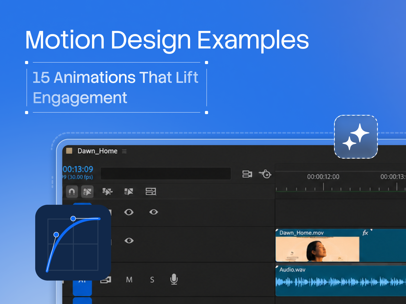
That gap is the entire point of studying motion design examples. Animation on a website isn't decoration you sprinkle on at the end.
It's a functional layer that, done right, guides attention, explains the product, and signals craft, and done wrong, tanks performance and annoys the very buyers you're trying to convert.
Below are 15 motion design examples worth stealing, each with what it does, where to use it, a brand that nails it, and the line where it tips from helpful to harmful. Read it as a toolkit, not a checklist. The best sites use a few of these with intent, not all fifteen at once.
Why Motion Design Matters for B2B and SaaS in 2026
Motion has quietly become a baseline expectation rather than a differentiator. The SaaS and design tools that set the standard (Framer, Linear, Vercel, Figma) all use motion heavily and purposefully, and buyers now unconsciously read a static, inert site as dated.
In a market where a prospect judges your product partly by the craft of your website, thoughtful motion is a trust signal. It says "we sweat the details," which is exactly what enterprise buyers want to believe about the software they're evaluating.
There's a functional case too, not just an aesthetic one. Nielsen Norman Group's research on animation is clear that motion, used well, aids usability: it directs attention, communicates relationships between elements, and provides feedback that makes an interface feel responsive. The keyword is used well.
The same research warns that gratuitous animation increases cognitive load and slows people down.
And every animation has a performance cost: heavy motion that hurts Core Web Vitals will cost you rankings and conversions, which Google Search Central has documented for years. The examples below are chosen because they earn their weight.
15 Motion Design Examples That Actually Lift Engagement
1. Scroll-Triggered Reveals
Elements fade, slide, or scale into view as the user scrolls to them. Why it works: it paces the experience, focuses attention on one idea at a time, and makes a long page feel alive rather than like a wall of content.
Linear and Stripe use it to make dense feature sections feel effortless. Best for: feature sections, homepages, storytelling pages. Watch out: keep it subtle and fast (200 to 400ms); reveals that make users wait to read content are friction, not delight.
2. Hover Micro-Interactions
Buttons, cards, and links respond the instant the cursor arrives, with a lift, a color shift, a subtle scale. Why it works: it confirms an element is interactive and makes the whole interface feel responsive and crafted.
This is the single highest-ROI motion you can add. Best for: every clickable element. Watch out: keep it consistent across the site; a design system for hover states beats one-off effects.
3. Animated Product Demos
A short, looping animation of the actual product doing the thing: a dashboard populating, a workflow completing. Why it works: buyers trust what they can see.
Datadog animates live-feeling dashboards, so the product becomes the marketing. Best for: the hero or product section of a SaaS site. Watch out: optimize the file (use video or Lottie, not a giant GIF) so it doesn't wreck load time.
4. Number Count-Ups
Key metrics animate from zero to their value as they scroll into view ("0 to 4,000+ teams"). Why it works: the motion draws the eye straight to your strongest proof points and makes stats feel like an achievement.
Best for: social-proof and results sections. Watch out: reserve it for numbers that matter; animating every figure dilutes the effect.
5. Loading & Skeleton States
Instead of a blank screen or a spinner, content areas show an animated placeholder of the layout to come. Why it works: it makes wait time feel shorter and the app feel faster, and it signals product polish.
Every top SaaS app uses skeleton screens now. Best for: dashboards, app-like interfaces, data-heavy pages. Watch out: if you need skeletons everywhere, the real fix may be actual performance.
6. Page & Section Transitions
Smooth transitions between pages or states instead of hard cuts. Why it works: it preserves context and makes navigation feel continuous and premium rather than jarring.
Framer-built sites are known for this. Best for: portfolio, product, and story-driven sites. Watch out: transitions that delay the user reaching content frustrate more than they delight, so keep them quick.
7. Sticky Scroll Storytelling
An element (a phone mockup, a product screen) stays pinned while surrounding copy scrolls and updates. Why it works: it walks the visitor through a sequence (steps, features, a narrative) while keeping the visual anchor in view.
Apple pioneered it; SaaS sites use it for "how it works." Best for: explaining a multi-step product or process. Watch out: it's heavy to build and can feel gimmicky if the story doesn't justify it.
8. Animated Illustrations (Lottie)
Lightweight vector animations (via Lottie) that bring illustrations and icons to life. Why it works: they add personality and explain concepts with motion at a tiny file size, far lighter than video.
Best for: empty states, onboarding, feature icons, 404 pages. Watch out: motion for its own sake still distracts; each animated illustration should clarify or delight, not just move.
9. Form Field Micro-Feedback
Fields respond as the user types: labels that float up, real-time validation, a checkmark on success. Why it works: it reduces form anxiety and error rates, and forms are where conversions live or die.
Best for: every signup, demo request, and contact form. Watch out: validation that fires too aggressively (red errors before the user finishes) frustrates, so time it right.
10. Text & Headline Reveals
Headlines that animate in (a fade, a subtle rise, a masked reveal) as the section loads. Why it works: it directs the eye to the message first and adds a beat of polish to the hero.
Best for: heroes and section intros. Watch out: avoid slow, letter-by-letter or fly-in effects that delay reading the most important words on the page.
11. Cursor-Aware Effects
Elements react to cursor position, with a subtle tilt, a spotlight, a magnetic button. Why it works: it creates a sense of depth and interactivity that feels modern and premium.
Design-forward brands like Framer use it as signature craft. Best for: portfolios, design and agency sites, hero moments. Watch out: desktop-only by nature; never let it be the only way to access something, and keep it tasteful.
12. Background Motion (Gradient & Mesh)
Slow, ambient movement in a gradient or mesh background. Why it works: it adds atmosphere and depth without competing with content, giving a static page a living quality.
Stripe and Vercel use animated gradients beautifully. Best for: heroes and section backgrounds. Watch out: keep it slow and low-contrast so it stays background; fast or busy motion here fights your copy.
13. Logo & Brand Motion
A brief, tasteful animation of the logo or brand mark on load or in the nav. Why it works: it reinforces brand identity and adds a signature moment.
Best for: intros, loading states, brand-led sites. Watch out: this is the classic overdone effect. A long logo animation on every page load is a conversion killer. Once, fast, and skippable.
14. Scroll-Linked Product Walkthroughs
Animated screenshots or UI that advance as the user scrolls, showing the product step by step. Why it works: it turns a static feature list into a guided demo the visitor controls with their scroll.
Best for: "how it works" and product-tour sections. Watch out: performance-heavy, so build it efficiently and provide a static fallback for reduced-motion users.
15. State-Change Animations
Smooth transitions when something changes: a toggle, a tab switch, an accordion opening, an item added. Why it works: it helps users understand what just happened and where their attention should go, reducing confusion.
Best for: pricing toggles, tabbed content, FAQs, filters. Watch out: keep it quick; slow state changes make an interface feel sluggish, not smooth.
When Motion Helps vs When It Hurts
The difference between the motion design examples that lift engagement and the ones that tank it comes down to three principles. Purpose: every animation should do a job, whether that's guiding attention, explaining a relationship, providing feedback, or adding a moment of brand delight.
If it does none of those, cut it; motion for its own sake is cognitive tax. Performance: motion has a cost, and heavy or unoptimized animation that hurts Core Web Vitals will cost you more in lost conversions than it gains in polish.
Use efficient techniques (CSS and libraries like GSAP over bloated assets, Lottie over huge GIFs, video over autoplay-everything).
The third principle is accessibility, and it's the one most teams forget. A meaningful share of users have motion sensitivities, and browsers expose a prefers-reduced-motion setting for exactly this reason, so respect it by dialing motion down or off for those users.
Good motion design isn't the site with the most animation. It's the site where every animation earns its place and no user is excluded or slowed down by it. Restraint is the skill. The sites that feel the most premium (Linear, Stripe, Vercel) use fewer, better animations than the busy sites that feel cheap.
The Windmark Approach: The Motion-With-Purpose Test
We build motion into B2B and SaaS sites across 120+ projects, and our rule is simple enough to say in one line: if an animation doesn't guide, explain, or delight, it doesn't ship. Before we add any motion, we run it through The Motion-With-Purpose Test, three questions:
- Does it guide? Direct attention, show a relationship, or provide feedback the user needs.
- Does it explain? Make the product or a step clearer than a static version would.
- Does it delight? Add a moment of brand craft, without costing performance or accessibility.
If a proposed animation can't answer yes to at least one, we cut it. And everything that ships gets checked against Core Web Vitals and prefers-reduced-motion before launch.
We build in Webflow (with GSAP for the complex interactions), which lets us ship rich, performant motion without a heavy custom front end, and lets your team keep the site fast while it grows.
Related: See our work · Motion design · SaaS Landing Page Design · How to build a B2B website on Webflow that converts
If your site feels flat next to the SaaS brands you admire, or busy in a way that's hurting it, the fix is purposeful motion, not more of it. Get a motion and UX review of your site and we'll show you the two or three animations that would lift engagement, and anything currently costing you speed.