
 ChatGPT
 Claude
 Gemini
 Perplexity AI
An AI startup founder opens three competitor homepages in new tabs to prep for a board deck.
All three say some version of "AI-powered platform that transforms how teams work." All three have a gradient hero, a chat-bubble illustration, and a CTA that says "Get Started." By the third tab, he can't remember which one does what, and neither can the buyer landing on any of these pages from a cold LinkedIn ad an hour later.
That's the actual problem in AI startup website design right now. It's not a lack of interest, it's a lack of differentiation in a category where everyone is shouting the same three words.
In 2026, "AI-powered" stopped being a selling point the moment it became table stakes. The startups winning the website battle aren't the ones with the boldest AI claims. They're the ones who can prove, in the first ten seconds, that the claim is actually true.
Why AI Startup Website Design Matters More in 2026
The AI category has gone from "who's doing this" to "who isn't doing this" in under two years, and buyer skepticism has scaled right alongside the hype.
A 2026 survey of enterprise technology buyers found that 78% believe many AI companies make claims that are difficult to verify or compare, and 69% say most AI companies sound so similar they're hard to tell apart (The Hoffman Agency, 2026).
Transparent explanations of how the product actually works were the single most common factor buyers cited for building confidence in a vendor.
This shift matters for website design specifically because the site is often the buyer's only interaction with the product before they request access.
Unlike a project management tool a prospect can trial in five minutes, most AI products require onboarding, data connection, or a sales conversation before anyone sees them work.
That means the website is carrying more of the credibility burden than it would in almost any other SaaS category. There's no quick trial to fall back on if the site doesn't convince.
The fact-checking instinct has gotten sharper too. A 2026 industry report found that 94% of B2B buyers who use AI tools during their research fact-check what those tools tell them, and product demos, free trials, and prior experience still outrank AI-generated summaries as the resources buyers trust most (TrustRadius, 2026).
If your homepage is the only thing standing between a skeptical, fact-checking buyer and a real answer, vague copy is a liability, not a placeholder.
What Makes AI Website Design Different From Other B2B SaaS
Most B2B SaaS website design optimizes for clarity of workflow: show the dashboard, show the integration, show the time saved. AI website design has an extra job. It has to prove the intelligence claim itself is real, not just describe the workflow around it.
That's a fundamentally different design problem. A project management tool doesn't need to convince you that "tasks" are real. An AI product does need to convince you that its output, the summary, the recommendation, the generated code, is trustworthy, accurate, and not a cherry-picked best case.
This pushes the best AI sites toward showing real, specific, sometimes unpolished outputs rather than the smooth, idealized product shots typical of standard SaaS website design.
AI sites also carry a heavier trust burden around data. Buyers want to know what happens to their data once it touches the model: is it used for training, is it retained, is it processed by a third-party API.
Sites that dodge this question with vague language lose technical buyers immediately, and once that buyer is gone, they rarely come back to give you a second chance to answer properly.
The Credibility Signals Every AI Startup Homepage Needs
Based on what actually moves AI buyers past the hero section, these are the signals worth prioritizing:
- A real output, not an illustration. Show an actual generated result, a real transcript, a real summary, a real piece of code, instead of an abstract gradient graphic implying "AI happening somewhere."
- Specific performance claims, not superlatives. "10x faster" means nothing without a baseline. "Cuts a 3-hour reconciliation to 12 minutes" is a number a buyer remembers and repeats internally.
- A clear, upfront data policy. State plainly whether customer data trains the model, how long it's retained, and what the security posture is. Buried in a footer link, this reads as evasive.
- Founder and team credibility. In AI more than most categories, buyers are evaluating whether this specific team can be trusted with a sensitive workflow. A founder's relevant background, prior company, or technical pedigree does real conversion work here, and it's part of why an AI startup's brand identity has to feel like it belongs to real people, not a logo generator.
- Named customers using it in production, not just pilot logos. "In production at [company]" carries far more weight than a logo wall with no context, and it lines up with what buyers say they trust most: real usage, not marketing claims.
Designing for Two Very Different Buyers
An AI startup's homepage has to survive two very different reads happening on the same page.
The technical evaluator, an engineer, a data lead, sometimes a CTO, is reading for accuracy, latency numbers, model provenance, and how the system fails. They want documentation links, benchmark data, and honesty about limitations.
The executive buyer, a VP, a founder, an ops lead, is reading for business outcome, risk, and how fast this gets adopted internally. They want proof points, case studies, and a clear sense of what changes in week one.
Most AI startup sites are written entirely for the second buyer and hope the first one either doesn't show up or gets satisfied with a "read our docs" link. That's a mistake.
The technical evaluator is often the one who kills or greenlights the deal internally, and a homepage that can't survive their scrutiny loses the sale before sales ever gets involved.
Why Pricing Pages Quietly Kill AI Startup Trust
This one doesn't get talked about enough. AI pricing is genuinely harder to communicate than SaaS seat-based pricing, and most AI startups solve that difficulty by hiding from it.
Usage-based pricing, token costs, and per-call charges are legitimate ways to price an AI product. Burying all of it behind "Contact Sales" is not a pricing strategy, it's an avoidance strategy, and buyers in this category have gotten very good at spotting the difference.
The buyer evaluating your AI product is usually also trying to model what this will actually cost at their scale, and if your pricing page can't help them do that, they'll assume the answer is "more than you think." That assumption alone kills deals that never even reach a sales call.
The fix isn't necessarily flat pricing. It's showing your math.
A simple usage calculator, a worked example ("a team processing 10,000 documents a month typically spends $X"), or even a plainly stated range does more trust-building work than a polished pricing table with three tiers and no numbers on the AI-specific tier.
Specificity here works the same way it does everywhere else on the site: it signals a team that isn't afraid of scrutiny.
Common AI Startup Website Mistakes That Kill Conversion
- Leading with the category instead of the outcome. "The future of [X], powered by AI" tells a buyer nothing about what changes for them specifically.
- Showing a polished demo GIF instead of a real product screenshot. Buyers have learned to distrust overly smooth product demos in this category. They read as marketing, not proof.
- Vague data and training language. Anything that sounds like it's avoiding the question ("we take privacy seriously") reads as a red flag to a technical buyer who's seen that phrase used to obscure exactly the practice they're worried about.
- No visible limitations or failure modes. Counterintuitively, acknowledging what the product doesn't do well builds more trust in this category than pretending it's flawless. Nielsen Norman Group's long-running research on web credibility has made the same point for two decades: up-front disclosure reads as confidence, not weakness (NN/g). Buyers assume every AI product has edge cases, and a founder who names them looks more credible, not less.
- Team and founder pages buried or missing entirely. In a category this new, buyers want to know who built this before they trust what it does.
The "Get Started" Button Is Doing More Work Than You Think
Every AI startup homepage has a version of the same CTA: "Get Started," "Try It Free," "See a Demo." Almost none of them design for what actually happens after someone clicks it, and that gap is where a lot of hard-won homepage trust quietly leaks away.
Think about the two ways this usually goes. Option one, the buyer gets dropped into a genuinely usable sandbox within seconds, no data connection required, and can see real output almost immediately.
Option two, the buyer fills out a form, waits for a sales-qualification email, and doesn't see the product work for another three days, if at all.
Both experiences are common in AI right now, and they build completely different amounts of trust, but plenty of startups still route every visitor through option two by default, even when a self-serve sandbox would convert better.
If your product genuinely needs a sales conversation before anyone can see it work, that's fine, but say so clearly and set expectations the way a well-designed demo request form would: what happens in the next 24 hours, who reaches out, and why the gate exists.
A visitor who understands why they're waiting is far more patient than one left guessing.
And if a lightweight, no-signup sandbox is possible even for a limited use case, it's often the single highest-leverage addition an AI startup can make to its site, because it turns the entire credibility argument from "trust our claims" into "see for yourself."
AI Website Examples Worth Studying
The AI products that have earned genuine buyer trust tend to share a pattern: they show real output early, they're specific about what the model does and doesn't do, and they treat documentation as a first-class part of the site rather than an afterthought for developers.
Products built around a clear, narrow use case, rather than a sweeping "AI for everything" pitch, also tend to convert better, because the buyer can immediately picture the exact workflow it replaces.
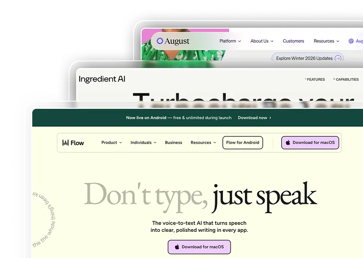
We saw this directly building the site for Wispr Flow, a voice-to-text AI product.
The challenge wasn't proving AI is impressive, it was proving this specific AI is fast and accurate enough to trust with every sentence someone types, which meant the design had to foreground real product behavior rather than abstract AI marketing language.
The Windmark PROOF Framework
Every AI startup site we build in Webflow runs through the same structural lens. We call it the PROOF Framework:
- P: Proof of real output. A genuine product result in the first screen, not an illustration of "AI happening."
- R: Real, specific performance claims. Numbers with a baseline, not superlatives without one.
- O: Origin and team credibility. Founder and team background surfaced clearly, especially for products handling sensitive data or workflows.
- O: Objective, limitation-aware language. Naming what the product doesn't do builds more trust than claiming it does everything.
- F: Foundation, data and security answered upfront. Training data policy, retention, and security posture stated plainly, not buried in a footer link.
This is the same lens behind our broader AI industry web design services, and it pairs directly with the CMS thinking behind a properly structured Webflow build, since a marketing team should be able to update proof points, benchmarks, and customer names without filing an engineering ticket every time a new case study lands.
What to Prioritize First If You're Working With a Tight Timeline
Most AI startups don't have a six-week runway for a full site rebuild before their next funding conversation or launch. If you're working against a deadline, here's the order we'd actually fix things in.
- Replace the hero's category claim with an outcome claim, and put a real product output next to it. If a visitor can't tell what specifically changes for them within five seconds, nothing else on the page matters yet.
- Add one clear sentence about data handling above the fold, or at minimum one click away. This alone reduces the single most common reason technical evaluators bounce before reading further.
- Only then move on to pricing transparency, the founder page, and the post-CTA experience. Sequencing matters here. A beautifully designed feature section sitting above a vague, unverifiable claim is still going to lose the skeptical half of your audience, and in AI, that's most of your audience.
If your site currently leads with "AI-powered" and a gradient hero instead of a real product result, that's usually the sign the credibility signals were never designed in, they were assumed. That's exactly the gap the PROOF Framework above is built to close.
For the same trust-first thinking applied to a different high-scrutiny buyer, see our fintech website design guide, or book a CRO and CMS audit and we'll show you where your current site reads as hype instead of proof.