 ChatGPT
 Claude
 Gemini
 Perplexity AI
Your product cuts clinician documentation time in half, and your pilot customer loves it. But when a health system's CMIO, CISO and VP of Finance each visit your website before the next meeting, they find a startup homepage with a stock photo of a smiling doctor, a vague "AI-powered care" headline and a demo form asking for a patient's date of birth. The deal doesn't die on the call. It dies quietly, in the three minutes each of them spent on your site.
Most healthcare website design advice is written for clinics and private practices: online booking, provider directories, patient portals. Digital health and healthtech companies have a harder brief. They sell into long, risk-averse buying processes where every stakeholder is looking for a reason to say no. This guide covers what makes a digital health website win that trust: the signals buyers look for, how to route multiple audiences, how to handle tracking and privacy, real examples worth studying and what to fix first.
Why Healthcare Website Design Matters More for Digital Health in 2026
Digital health buying has become more cautious and more crowded at the same time. Health systems and payers are being pitched dozens of AI tools, care platforms and data products, often with similar claims. Buyers respond by doing more homework before talking to sales, and your website is where that homework starts.
Three pressures shape healthtech websites this year:
Every buyer is a committee. A single deal might involve a clinical champion, a CMIO or CNIO, IT security, procurement and finance, and for employer-sold products, HR benefits leaders and consultants. Each wants different proof.
"AI-powered" no longer differentiates. With AI scribes, copilots and analytics everywhere, buyers look past the label to evidence: which organisations use you, what changed, and how you handle data.
Privacy scrutiny reaches the website. The US Department of Health and Human Services' Office for Civil Rights has published guidance on online tracking technologies for HIPAA-regulated entities. A careless analytics or ad pixel setup can become a risk your buyer's security team spots.
What Makes Digital Health Website Design Different From Other B2B SaaS
On the surface, a healthtech website looks like any SaaS website: hero, logos, features, demo CTA. Underneath, four differences change the design.
1. The cost of being wrong is clinical. Buyers aren't just asking "will this save time?" They're asking "is this safe, accurate and defensible if something goes wrong?" Claims need sources, and copy needs to survive clinical and legal review.
2. There's often a patient or member on the other side. Companies like Hinge Health and Spring Health sell to employers and health plans, but their end users are members who need to check eligibility, enrol and get care. The site has to serve both without confusing either.
3. Proof has a different hierarchy. In general SaaS, customer logos and G2 badges carry a lot of weight. In healthcare, buyers look for health system names, peer-reviewed or clinical studies, regulatory status (such as FDA clearance where relevant), KLAS recognition and security documentation.
4. Privacy and accessibility are part of the product. A healthcare buyer reads a slow, inaccessible site with uncontrolled tracking scripts as a preview of how you'll handle their data and their patients.
The Trust Signals Every Digital Health Homepage Needs
These are the signals we see the strongest healthtech websites place in the first two screens. Our B2B website design examples show the same pattern across other categories, but healthcare buyers weigh it more heavily.
- Named customers that buyers respect. Health system, payer or employer names your buyers recognise. Abridge's homepage shows Kaiser Permanente, Johns Hopkins Medicine, Duke Health and UPMC, with "Trusted by 300+ health systems" in the hero.
- Outcomes attributed to customers. "83% reduction in note-writing effort" is strong. "83% reduction in note-writing effort (Sharp)" is far stronger. Abridge pairs nearly every metric with a named health system.
- Clinical and economic evidence. Links to clinical studies, outcome reports and independently validated ROI. Hinge Health links to "Clinical studies" and cites an independently validated ROI figure.
- Third-party validation. KLAS recognition, analyst coverage, regulatory clearances and certifications, stated plainly and linked where possible.
- Security and data handling. A public Trust Center or security page covering compliance status, data handling and how to request documents. Komodo Health links to a public Trust Center and explains that its data is de-identified.
- The people behind the care. For care-delivery companies, show the clinical team and medical leadership. Credentials build trust faster than illustrations.
Designing a Healthcare Website for Multiple Buyers
Most digital health companies sell to at least two audiences, often five. The website has to recognise each visitor quickly and send them to the right path.
Hinge Health shows the two-sided version well. Members see "Am I eligible?" and "Enroll now." Business visitors see "Request a business demo." The navigation separates employers, health plans, consultants, ecosystem partners and providers. Each audience gets its own language and CTA without leaving the homepage.
Spring Health routes even more audiences (members, employers, health plans, channel partners, consultants and providers), with member CTAs like "Check your coverage" sitting alongside business CTAs like "Request a demo."
Abridge addresses health systems, payers and life sciences organisations in the hero, then walks through the care workflow (pre-visit, encounter, post-visit) so clinicians, nurses, revenue cycle teams and IT can each find their part.
Design rules for multi-buyer healthcare sites:
- Pick a primary buyer for the homepage hero, then route everyone else with clear navigation or a short "I am a…" selector.
- Give each audience its own page and CTA, so clinicians, executives and members aren't reading one compromise page.
- Keep member actions separate from sales actions. A member looking for eligibility shouldn't land on a demo form, and vice versa.
- Write for the skeptic in each group. Clinicians want workflow detail, finance wants ROI, IT wants integrations and security.
Privacy, Tracking and HIPAA on Healthcare Websites
This is where healthcare website design differs most from regular B2B, and where marketing teams most often create risk without realising it. This section is practical guidance, not legal advice. Confirm your obligations with counsel.
According to HHS's Office for Civil Rights, HIPAA rules apply when information collected through tracking technologies by regulated entities includes protected health information (PHI). HHS states that tracking technologies on user-authenticated pages, such as patient portals and telehealth platforms, "generally have access to PHI," so they must be configured to comply with the Privacy and Security Rules.
There's an important nuance for public marketing pages. On 20 June 2024, a federal court in American Hospital Association v. Becerra vacated part of the HHS guidance. Specifically, it vacated the part saying HIPAA is triggered when tracking connects an individual's IP address with a visit to an unauthenticated public page about specific health conditions or providers. HHS notes it is "evaluating its next steps." Other privacy laws, including state health privacy laws and FTC rules, may still apply.
Practical rules we follow for healthtech marketing sites:
- Separate the marketing site from the product. Keep the Webflow marketing site and any logged-in portal or app on separate systems and subdomains, with separate tracking setups.
- No ad pixels on authenticated pages. Keep advertising and session-recording scripts off portals, patient-facing app pages and anything behind a login.
- Don't collect PHI through marketing forms. Demo and contact forms should ask for work details only, never symptoms, conditions, dates of birth or patient information.
- Audit every third-party script. Chat widgets, scheduling embeds, heatmaps and ad pixels all send data somewhere. Document what each one collects.
- Use consent management that actually blocks non-essential scripts until consent is given, especially for EU and UK visitors.
- Make accessibility part of compliance. Healthcare buyers and public-sector customers increasingly expect WCAG conformance. See our accessibility guide for SaaS websites.
Common Healthcare Website Mistakes That Kill Trust
- Stock-photo healthcare. Smiling doctors with stethoscopes signal "generic." Use real product screenshots, real clinicians and real customer environments.
- Unsourced clinical claims. "Improves outcomes" without a study, customer or number reads as marketing and won't pass clinical review.
- One page for every audience. Clinicians, CFOs and members get one compromise message that convinces none of them.
- Demo forms that ask too much, or the wrong things. Long forms slow conversions, and fields that invite patient information create risk.
- Hidden security information. If IT has to email sales to learn how you handle data, you've added weeks to the deal.
- A slow, inaccessible site. Heavy animations, poor contrast and missing keyboard support undercut a company that claims to improve care.
Healthcare and Healthtech Website Examples Worth Studying
Abridge (clinical AI documentation). Leads with "Enterprise-Grade AI for every moment of care" and immediately proves it: 300+ health systems, recognisable health system logos, Best in KLAS 2025 and 2026, and metrics attributed to named customers. Steal this: put a customer name next to every outcome.
Hinge Health (virtual MSK care). A clean two-sided design: "Am I eligible?" for members and "Request a business demo" for employers and plans. Business proof covers contracting ("5 out of 5 national health plans") and independently validated ROI. Steal this: separate member actions from buyer actions everywhere.
Spring Health (mental health benefits). Routes members, employers, health plans, partners and providers from one homepage, with a low-friction member CTA ("Check your coverage") next to a demo request. Steal this: make the first action for each audience small and specific.
Komodo Health (healthcare data and AI). Leads with a clear promise ("Ask Any Question About Healthcare and Get an Answer You Can Use") and supports it with scale (330M+ de-identified patients), a public Trust Center and named life sciences customers. Steal this: make data handling visible on the homepage, not buried in legal pages.
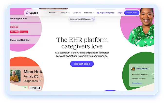
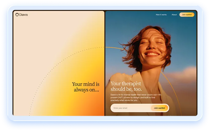
From our own work: at Windmark, we've built websites for healthtech teams including August Health (AI-enabled care infrastructure for senior-living operators), Orbem AI (AI-powered MRI scanning) and Dawn (an AI emotional-support companion). Each one needed to explain complex technology clearly to cautious buyers. See more on our healthcare industry page.
The Windmark CARE Framework for Healthcare Websites
We plan every healthtech website around four principles we call the CARE Framework, a healthcare counterpart to the TRUST Framework we use for fintech websites.
- C: Clinical credibility. Every claim is accurate, sourced and written to survive clinical and legal review. Clinical leadership and evidence are visible.
- A: Audience routing. Each buyer and user group (clinicians, executives, IT, employers, plans, members) gets a clear path, page and CTA within one click of the homepage.
- R: Risk and privacy by design. Marketing and product are separated, there's no tracking on authenticated pages, forms collect no PHI, third-party scripts are documented, and accessibility is built in from the first component.
- E: Evidence with specifics. Named customers, attributed outcomes, third-party validation and a security or Trust Center page, placed in the first two screens.
Through our web design and Webflow development services, we build these sites on Webflow, so marketing teams can publish new case studies, outcomes and clinical content quickly, without developer tickets, while the system keeps design and accessibility consistent. Healthcare builds typically take about four weeks, or six to eight for larger or more regulated projects.
See the project: How we built the August Health website
What to Prioritise First on a Tight Timeline
If you have a board meeting, a launch or an RFP in six weeks, focus here:
- Homepage hero and proof. Rewrite the headline to say exactly what you do and for whom, and add named customers and two attributed outcomes.
- A security and data page. Even a single page covering compliance status, data handling and how to request documents removes friction from every deal.
- Audience routing. Add clear paths for your top two or three audiences, each with its own CTA.
- A tracking and forms audit. Remove pixels from anything authenticated, strip PHI-prone fields from forms and document your scripts.
- An accessibility pass. Fix contrast, headings, alt text and keyboard navigation on your key pages.
Everything else, including motion, illustration and full content libraries, can come in phase two.
If your product is ready for health systems, payers or employers but your website still reads like a seed-stage pitch, you're losing deals before the first call. Windmark designs and builds healthcare websites for digital health and healthtech companies using the CARE Framework: credible, clearly routed, privacy-aware and evidence-led, on a Webflow site your team can keep current. Book a 30-minute healthcare website review, and we'll show you where buyers lose confidence on your current site and what to fix first.