 ChatGPT
 Claude
 Gemini
 Perplexity AI
You've opened 30 tabs of "best B2B websites" for inspiration, and every list shows the same thing: big hero, gradient, logo wall. Your designer loves three of them. Your CEO likes a different three. Nobody can explain why any of them work. So the redesign brief turns into a mood board, and six months later you have a prettier site with the same demo-request rate.
The problem isn't a lack of examples. It's that most B2B website design roundups judge sites on looks. This one doesn't. We looked at 15 live B2B websites in October 2026, across SaaS, fintech, infrastructure, logistics and manufacturing. Each one is scored on the same four conversion layers, and each ends with the one move worth stealing. We deliberately skipped the usual suspects (Stripe, HubSpot, Notion, Figma), because we've already torn those down in our 20 biggest SaaS companies breakdown.
Why B2B Website Design Matters More in 2026
B2B buyers do most of their evaluation without you. Gartner's research on the B2B buying journey found that buyers spend only 17% of their total buying time meeting with potential suppliers, and that time is split across every vendor they're evaluating. The rest happens on their own: on your website, in review sites, and increasingly inside AI assistants that summarise your site for them.
Attention is short, too. Nielsen Norman Group found that users often leave a web page within 10–20 seconds unless it gives them a clear reason to stay. For a B2B site, that clear reason has to work for a buying committee: a champion who wants to understand the product, a technical evaluator who wants specifics, and an economic buyer who wants proof and price.
That's why the gap between a decorative B2B website and a converting one keeps widening. The sites below aren't the most beautiful on the internet. They're the ones that make a complex purchase feel simple.
How We Scored These B2B Website Examples: The 4-Layer Conversion Stack
Every site was reviewed against the Windmark 4-Layer Conversion Stack, the same framework we use to plan every B2B site we build. (We cover it in depth in How to Build a B2B Website on Webflow That Converts.)
| Layer | Where it lives | The question it answers |
|---|---|---|
| 1. Clarity | Above the fold | "What is this, and is it for me?" |
| 2. Credibility | Directly after the hero | "Why should I believe you?" |
| 3. Specificity | The body | "Does this solve my problem, in my context?" |
| 4. Confidence | CTAs, pricing, footer | "What happens if I take the next step, and is it safe?" |
Most sites are good at one or two layers. The examples below are grouped by the layer each one does best, so you can borrow the move that fixes your weakest layer. All observations are from the live sites in October 2026. B2B sites change often, so treat the specific copy as a snapshot, not a permanent fixture.
Layer 1: B2B Websites That Win on Clarity
1. Attio (CRM)
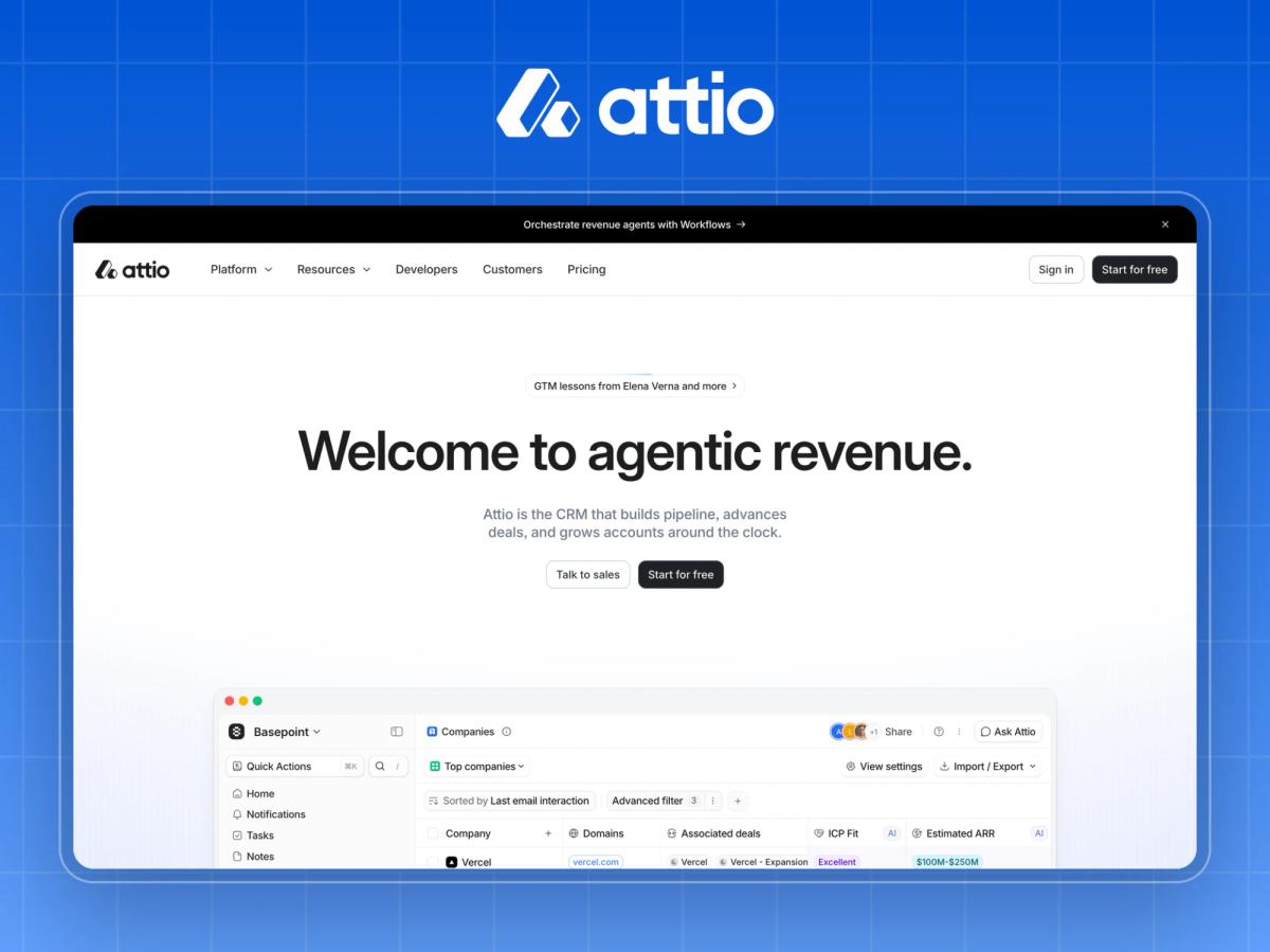
What it is: An AI-native CRM for startups and scaling go-to-market teams.
Headline: "Welcome to agentic revenue." The subhead immediately grounds it: "the CRM that builds pipeline, advances deals, and grows accounts around the clock."
Why it converts: Attio pairs a category-creating headline with a plain-English subhead, so it gets the excitement of a new idea without losing the visitor. The dual CTA ("Start for free" and "Talk to sales") serves product-led and sales-led buyers from the same hero, and "Trusted by 30,000+ customers" lands right underneath. Lower down, a customer story leads with an outcome ("83% faster lead triage") rather than a feature.
Watch out: A coined phrase like "agentic revenue" only works because the subhead does the explaining. Remove the subhead and the hero becomes a riddle.
Steal this: If your headline is ambitious, make your subhead brutally literal.
2. Mercury (fintech)
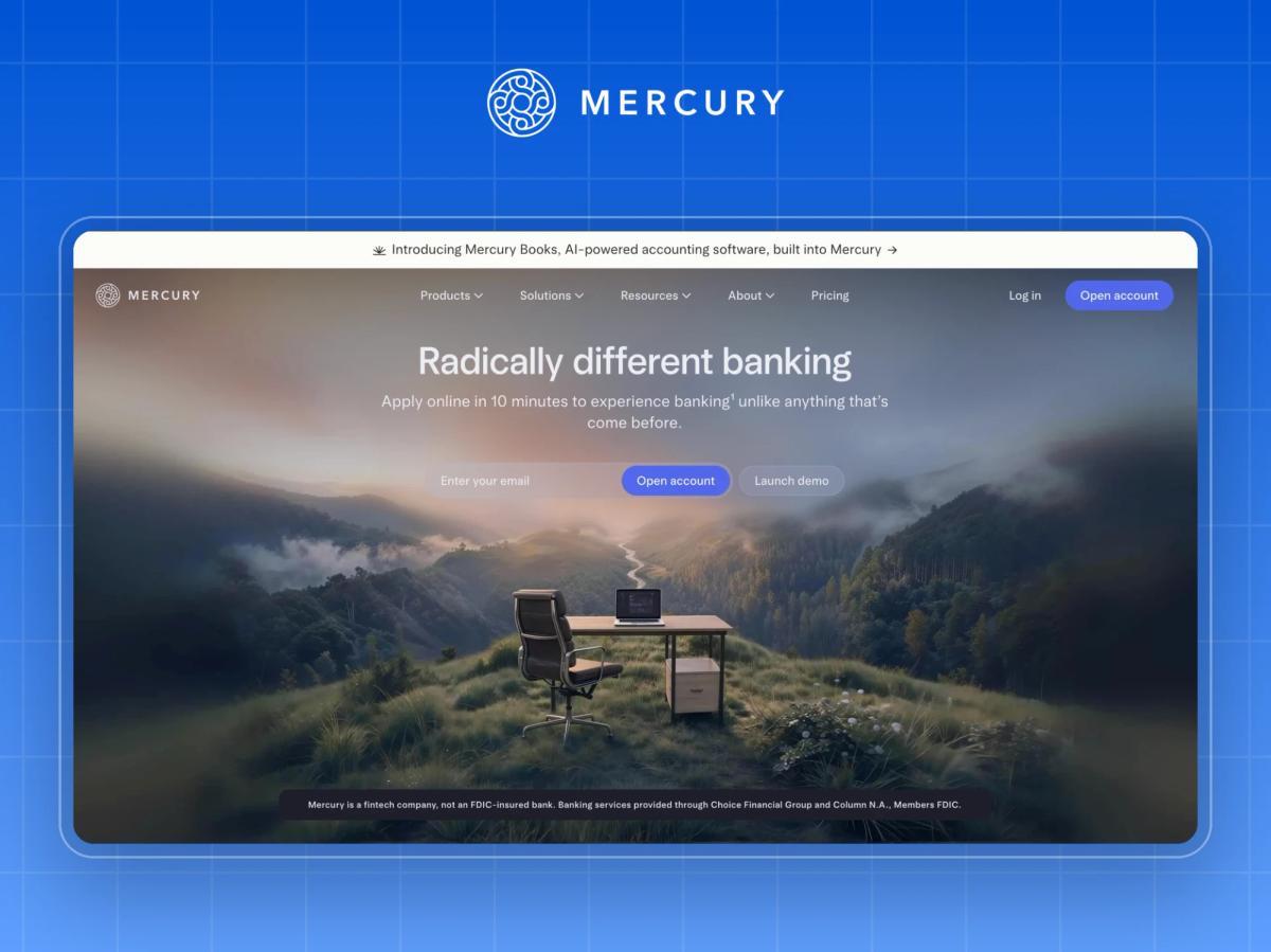
What it is: Business banking for startups and growing companies.
Headline: "Radically different banking," with the subhead "Apply online in 10 minutes."
Why it converts: Mercury puts a time-to-value promise ("10 minutes") in the second line, which is the single biggest objection for anyone switching banks. The trust signals are pitched exactly right for fintech: a 4.9-star app rating, "300K+ entrepreneurs", and, unusually, a plain regulatory disclaimer that Mercury is a fintech company, not an FDIC-insured bank. Being upfront about what you are reads as confidence, not weakness.
Watch out: "Radically different" is a claim every challenger makes. The page earns it later with specifics (no-fee USD payments, cashback and treasury yield), but the headline alone wouldn't.
Steal this: Put your fastest credible time-to-value number in the first two lines. (More on this in our fintech website design guide.)
3. Vanta (security and compliance)
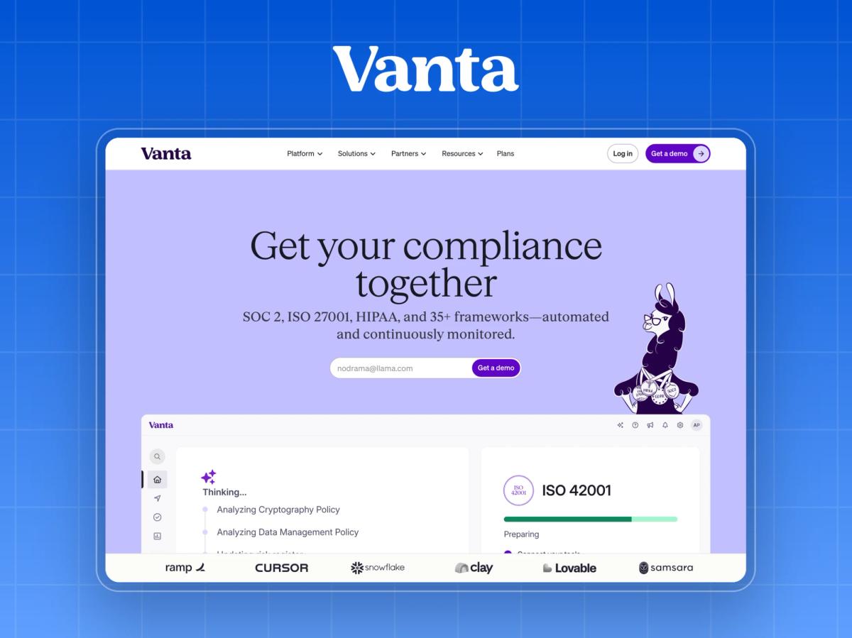
What it is: Automated compliance and trust management software.
Headline: "Get your compliance together," with the subhead naming the frameworks outright: "SOC 2, ISO 27001, HIPAA, and 35+ frameworks."
Why it converts: Vanta's buyers search for acronyms, not concepts. Putting SOC 2, ISO 27001 and HIPAA directly in the subhead confirms relevance in under three seconds. The headline also does something rare in B2B: it has a personality ("get your compliance together") while still being specific. Proof follows immediately, with "16,000+ customers" and customer-attributed outcomes like "20% faster deal cycles" (Clay).
Watch out: The products menu lists 11 items. Powerful for evaluators, overwhelming for first-time visitors.
Steal this: Use the exact words your buyers search for in the hero, even if they're acronyms.
4. Samsara (industrial IoT)
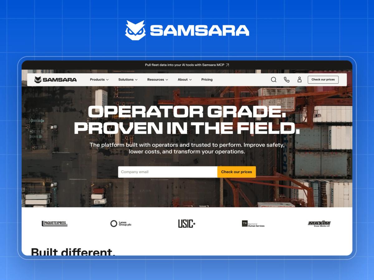
What it is: A connected operations platform for fleets, construction, field services and other physical operations.
Headline: "Operator grade. Proven in the field."
Why it converts: This is B2B design for an audience that isn't sitting in a SaaS office. The language ("operator grade", "in the field") speaks to operations leaders in their own words. The navigation routes by industry (transportation, construction, food and beverage, public sector), and the proof is physical and concrete: "380k+ accidents prevented", next to logos like DHL and Home Depot. The primary CTA, "Check our prices", is a bold choice for a hardware-plus-software business, and it filters for serious buyers.
Watch out: Over 20 logos above the fold is a lot. It works here because the logos come from Samsara's target industries, not generic tech brands.
Steal this: Write your hero in the language of the person doing the job, not the person buying software.
Layer 2: B2B Websites That Win on Credibility
5. Gong (revenue intelligence)
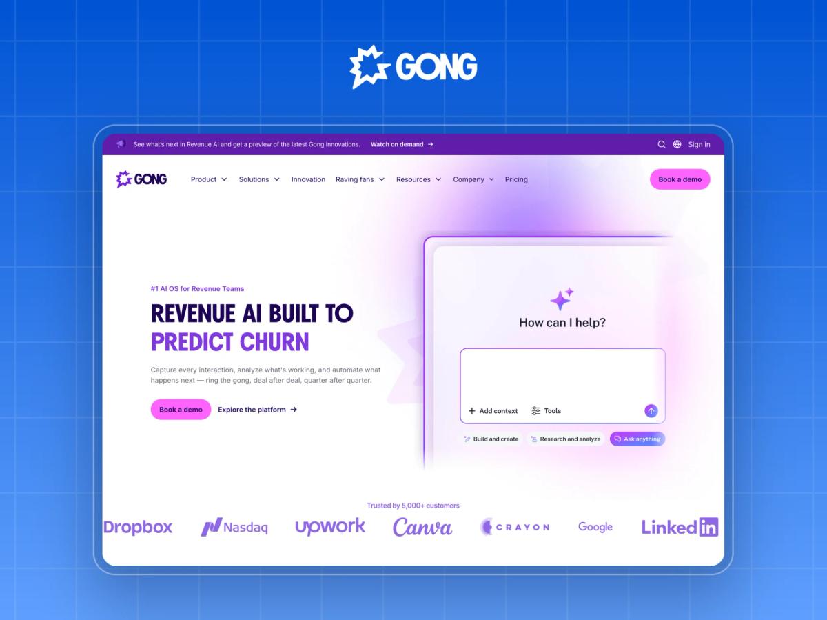
What it is: An AI platform for revenue teams, covering call recording, forecasting and sales engagement.
Headline: "#1 AI OS for Revenue Teams."
Why it converts: Gong stacks every type of proof a sales leader checks, in order: customer count ("5,000+ customers"), peer reviews ("4.8/5 across 6,200+ G2 reviews"), analyst validation (Forrester Wave leader), and a named customer outcome. Each signal answers a different stakeholder: peers, analysts and the CFO.
Watch out: A "#1" claim in the headline needs immediate backing, or it reads as hype. Gong gets away with it because the backing sits directly underneath.
Steal this: Layer your proof by type (customers, reviews, analysts, outcomes), not just by volume.
6. Deel (global HR and payroll)
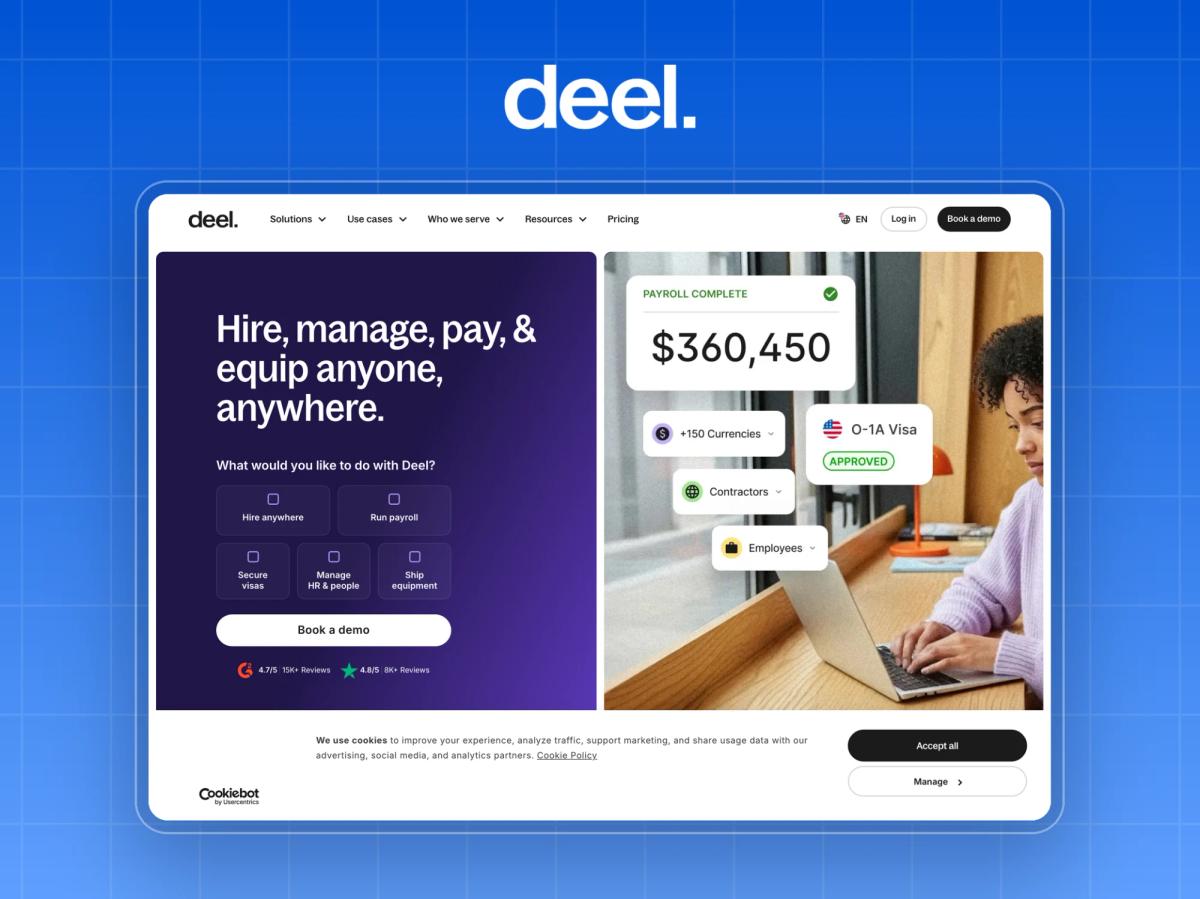
What it is: A platform to hire, pay and manage employees and contractors around the world.
Headline: "Hire, manage, pay, & equip anyone, anywhere."
Why it converts: Deel shows ratings from two independent review platforms (G2 and Trustpilot, both 4.8 with thousands of reviews), names a recognisable customer quote from Robinhood's SVP of Finance, and signals depth with "175 stories" of customer results. The hero also asks, "What would you like to do with Deel?" and offers options, which turns a broad platform into a personal starting point.
Watch out: A four-verb headline is long. It works because each verb maps to a real product line in the navigation.
Steal this: Show proof from more than one independent source. One badge looks like marketing, and two look like consensus.
7. Clay (GTM data and workflows)
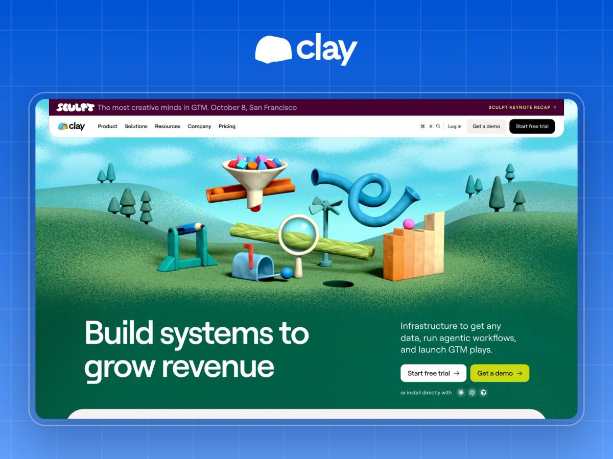
What it is: Data enrichment and workflow infrastructure for go-to-market teams.
Headline: "Build systems to grow revenue."
Why it converts: Clay's metrics are always attributed: "+140% outbound pipeline" (Intercom), "+50% lift in close-rate" (Hex), "+19% more revenue per rep" (Terrapinn). Attributed numbers are far more believable than anonymous percentages. A tabbed use-case section (TAM sourcing, inbound, lead scoring, CRM enrichment) lets each visitor find their own job-to-be-done.
Watch out: "Trusted by more than 500,000 GTM teams" is a huge number that invites scepticism. The named metrics carry more weight than the headline count.
Steal this: Never publish a percentage without a customer name next to it.
8. Retool (internal tools and AI apps)
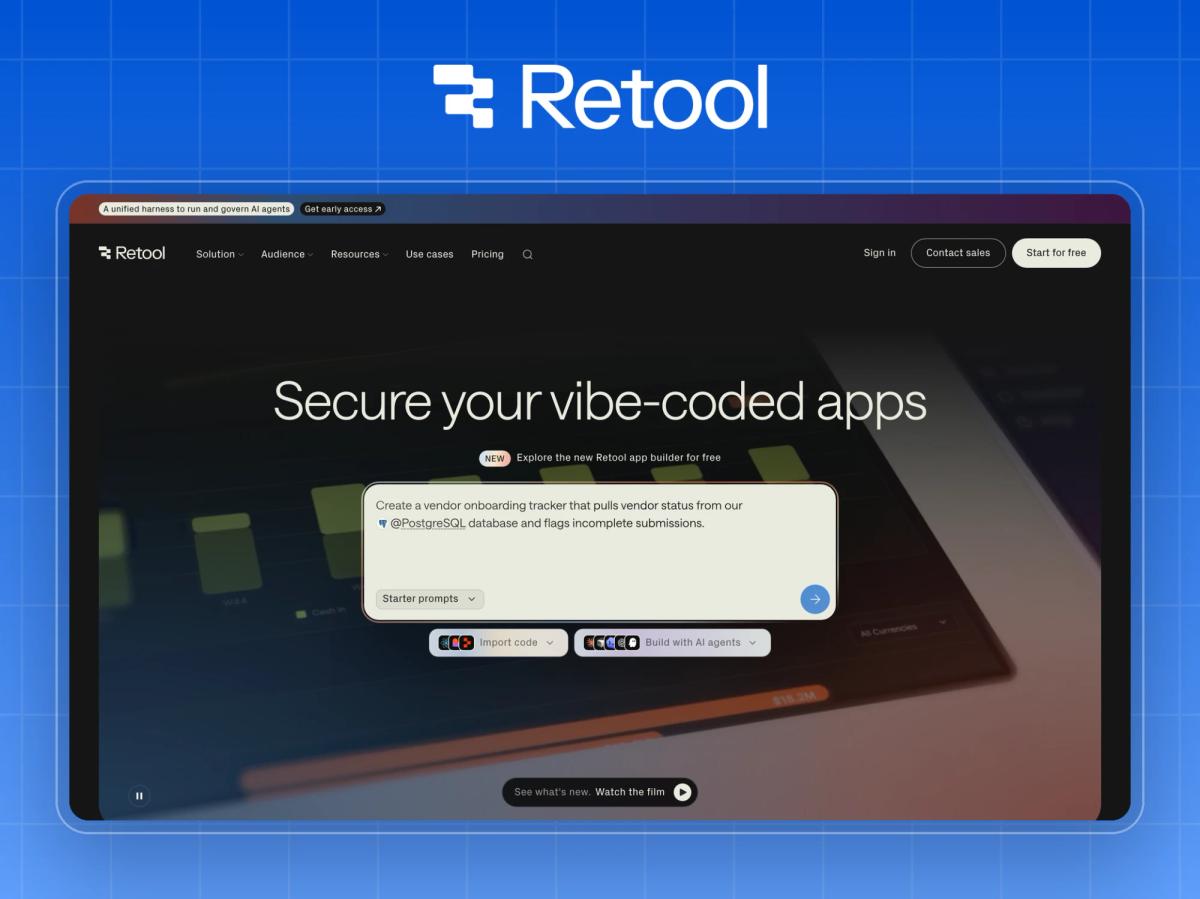
What it is: A platform for building internal tools and AI applications.
Headline: "Secure your vibe-coded apps."
Why it converts: Retool's credibility section speaks the language of the economic buyer: "Ramp saved $8M and 20,000+ hours" and "DoorDash saved $6M and 36,000+ hours." Dollar-and-hours outcomes from named companies are exactly what a VP of Engineering forwards to finance. Enterprise logos (Amazon, Boeing, Adobe) answer the "will it scale?" question before it's asked.
Watch out: The headline is tied to a very current trend (vibe coding). That's great for relevance today, and it means the hero has to be revisited when the trend moves on.
Steal this: Express outcomes in money and time saved, the two units every budget holder understands.
Layer 3: B2B Websites That Win on Specificity
9. Rippling (workforce platform)
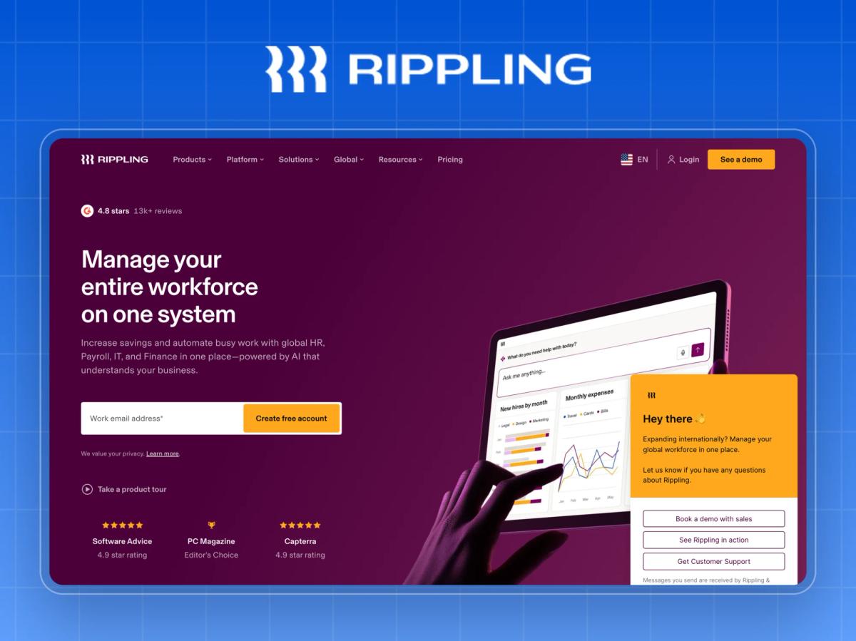
What it is: HR, IT, finance and payroll on one platform.
Headline: "AI that knows your company, and acts like it."
Why it converts: Rippling sells a broad platform without becoming vague by breaking it into module cards (HR, IT, Finance, Payroll, Custom applications, AI), each with its own "Get a demo" CTA. Buyers enter through the product they need today. The hero also captures intent early with a work-email field ("Create free account") and an alternative path ("Take a product tour"). Proof is specific: "80% of Clay's onboarding tasks automated."
Watch out: Many repeated "Get a demo" buttons can dilute the main conversion path. It works here because each one routes to a product-specific demo.
Steal this: If you sell a platform, let buyers enter through a module, then sell them the platform.
10. Carta (private capital software)
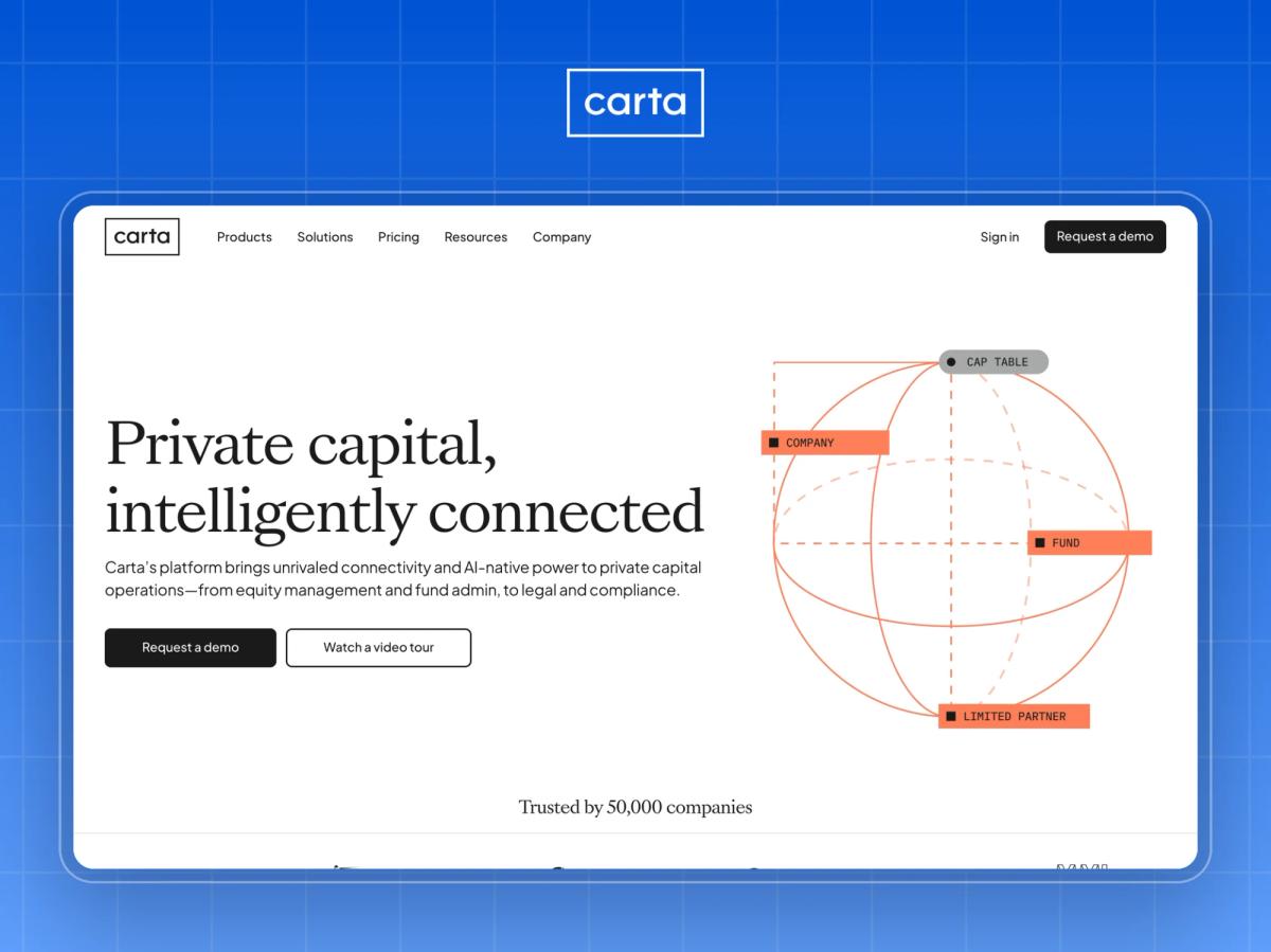
What it is: Equity management, fund administration and legal services for private companies and investors.
Headline: "Private capital, intelligently connected."
Why it converts: Carta serves very different audiences: founders managing a cap table, venture funds, private equity firms and limited partners. The homepage routes each one to a dedicated solution path, so a VC partner never has to wade through startup messaging. It also serves region-specific versions (our visit was redirected to the APAC site with regional investor logos), which makes the proof locally relevant.
Watch out: Audience-based routing only works if each destination page is just as strong as the homepage. Weak sub-pages break the promise.
Steal this: If you have more than one buyer type, give each its own door on the homepage.
11. Formlabs (3D printing hardware)
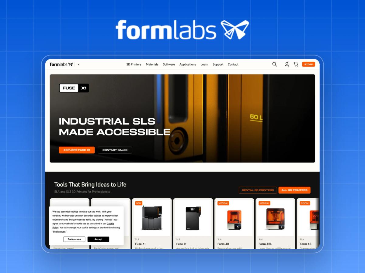
What it is: Professional SLA and SLS 3D printers, materials and software.
Headline: "Tools That Bring Ideas to Life."
Why it converts: This is a manufacturing B2B site that behaves like a great SaaS site. The navigation splits by industry (engineering, dental, medical, aerospace, jewellery), and the secondary hero CTA goes straight to "Dental 3D Printers", dedicating prime real estate to a high-value vertical. Named case studies (Tesla, Ford, Eaton) and an ROI calculator give engineers and finance something concrete.
Watch out: The headline itself is generic. The site's specificity lives in the navigation and the CTAs, not the copy.
Steal this: Give your most valuable vertical its own CTA in the hero.
12. Webflow (website platform)
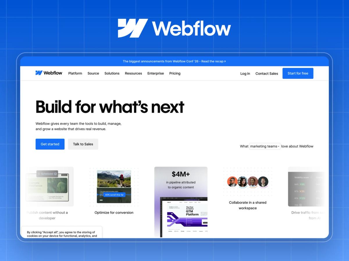
What it is: A visual website platform for marketing teams, designers, developers and agencies.
Headline: "Build for what's next."
Why it converts: Webflow's homepage is a masterclass in persona routing. After the hero, content splits by audience (marketers, designers, developers, agencies), each with its own value story. Proof is outcome-led: customer stories with metrics like "$6M in cost savings annually" and logos from brands like The New York Times and DocuSign. The dual CTA ("Get started" and "Talk to Sales") captures self-serve and enterprise buyers.
Watch out: "Build for what's next" could describe almost anything. The persona sections do the real positioning work.
Steal this: Write a section for every persona on the buying committee, not just the champion.
Disclosure: Webflow is the platform we build on at Windmark.
Layer 4: B2B Websites That Win on Confidence
13. Intercom (customer service AI)
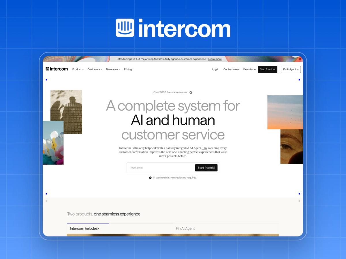
What it is: A helpdesk with a built-in AI agent, Fin.
Headline: "A complete system for human and AI customer service."
Why it converts: Intercom puts pricing on the homepage: "$29 per seat/mo + $0.99 per outcome", with the reassurance that you can "set spending limits so costs never exceed your budget." For a usage-based AI product, that answers the scariest procurement question (how big could this bill get?) before it's asked. Proof is strong too: "Trusted by 30,000+ leading brands", with Anthropic and Clay named.
Watch out: Publishing pricing commits you to it. If your pricing changes quarterly, homepage pricing becomes a maintenance burden.
Steal this: Address your buyer's biggest risk (cost overrun, lock-in, implementation time) next to the CTA.
14. Flexport (logistics)
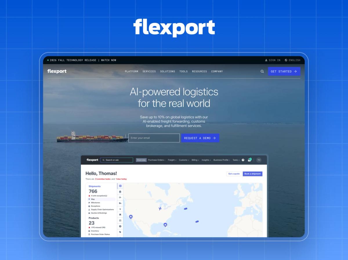
What it is: AI-enabled freight forwarding, customs brokerage and fulfilment.
Headline: "AI-powered logistics for the real world."
Why it converts: The subhead makes a quantified promise: "Save up to 10% on global logistics." The proof is operational, not vanity: "99% final mile and 95% global mile" on-time delivery, and "13,000 companies across 24 time zones." The secondary CTA is an AI "Search or ask" box, a low-commitment way to engage that suits buyers who aren't ready for a demo.
Watch out: "Up to 10%" is a ceiling, not an average. Sophisticated buyers notice. Pair ceiling claims with a typical-case proof point.
Steal this: Offer a low-commitment second CTA for buyers who are interested but not demo-ready.
15. Cloudflare (infrastructure and security)
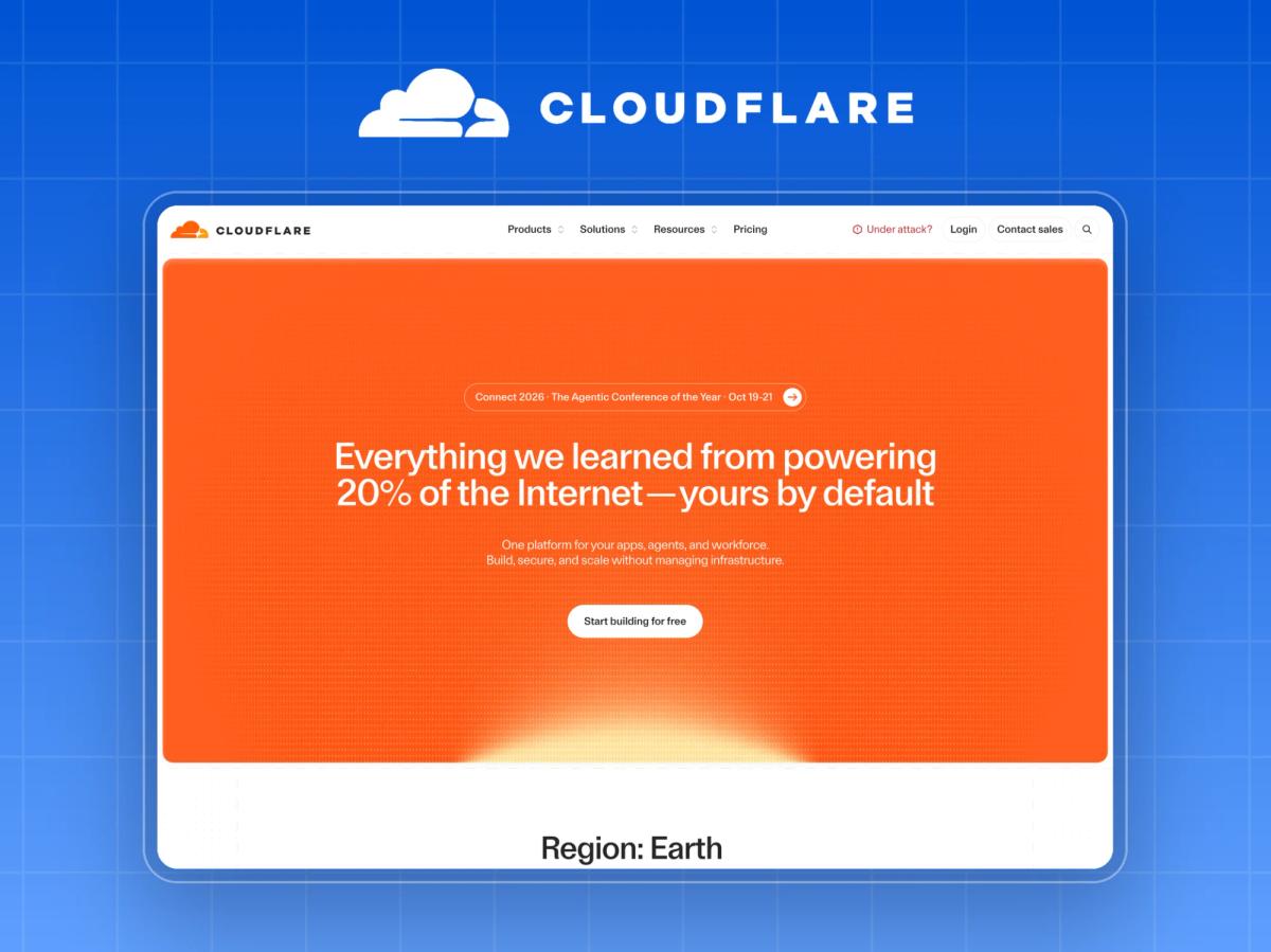
What it is: A global network for application performance, security and developer compute.
Headline: "One platform for your apps, agents, and workforce."
Why it converts: Cloudflare publishes plan pricing on the homepage (Free at $0, Pro at $20/mo and Business at $200/mo, billed annually) alongside massive-scale proof: "powering 20% of the Internet" and "45% of the Fortune 500." The free tier plus transparent pricing means a developer can start in minutes, while the scale stats reassure the enterprise buyer who'll eventually sign the contract.
Watch out: A homepage serving developers, security teams and enterprise buyers at once is dense. Cloudflare can afford that because its brand recognition is high, and most companies can't.
Steal this: Let the smallest buyer start for free while showing the largest buyer you can handle their scale.
What the Best B2B Websites Have in Common
Looking across all 15 live sites in October 2026, five patterns stood out.
| Pattern | How many of the 15 | What it means for your site |
|---|---|---|
| Customer count or hard metric in the first screen or two | 12 of 15 | Proof is part of the hero, not a section further down |
| AI mentioned in the hero headline or subhead | 10 of 15 | AI is table stakes, so differentiate on what job it does |
| Routing by persona, industry or product module | 9 of 15 | One generic homepage path no longer serves a buying committee |
| A self-serve path alongside "talk to sales" | 7 of 15 | Product-led and sales-led buyers both need a door |
| Pricing or pricing CTA on the homepage | 4 of 15 | Transparency is moving upmarket, even for enterprise tools |
The point isn't to copy all five. It's to find your weakest layer and fix it first. A beautiful hero won't save a page with no proof, and great proof won't help if visitors can't tell who the product is for.
The Windmark Approach: The 30-Minute Conversion Stack Audit
Before we redesign any B2B website, we run a short audit of the existing site using the same four layers. You can run it yourself this week. It takes about 30 minutes and needs three people: someone from marketing, someone from sales, and someone who has never seen the site.
- Clarity test (5 minutes). Show the outsider your homepage for 10 seconds, then close it. Ask: what does the company do, and who is it for? If they can't answer both, your hero fails Layer 1.
- Credibility scan (5 minutes). Count the proof elements in your first two screens. Score one point each for a customer count, a named customer, an attributed metric, an independent review rating, and analyst or compliance validation. Under three means Layer 2 needs work.
- Specificity map (10 minutes). Ask sales to name your top three buyer types. Click from the homepage as each one. Does each find a page that speaks directly to them within two clicks?
- Confidence check (10 minutes). For your primary CTA, write down what the buyer fears will happen next: a pushy sales call, a long implementation, an unknown price. Is that fear addressed anywhere near the button?
Score each layer red, amber or green. Fix the reds before you touch visual design. In our experience, most B2B redesigns that fail to lift conversions skipped this step and went straight to the mood board.
See it in practice: Browse Windmark's client projects
B2B Website Design Best Practices to Take From These Examples
If you take nothing else from these 15 examples, apply these five practices to your next website redesign:
- Make your subhead do the explaining. A bold headline can be ambitious (Attio, Webflow) only if the subhead is literal.
- Attribute every number. "+140% pipeline (Intercom)" beats "+140% pipeline" every time.
- Mirror your buyer's vocabulary. Acronyms (Vanta), job language (Samsara) and industry terms (Formlabs) beat clever copy.
- Build a door for each buyer. Route by persona, industry or module as soon as you have more than one buyer type.
- Defuse the scariest next step. Pricing, spend caps, time-to-value or a low-commitment second CTA should sit near your primary button.
For the page-by-page version of these principles, see our SaaS landing page anatomy guide. If you'd rather have a team do it, we've also compared the best B2B web design agencies in 2026.
If you've collected a folder full of B2B website examples and still can't tell what your own site should change, start with the audit, not the mood board. Windmark's B2B web design team runs the 4-Layer Conversion Stack audit on your current site and shows you which layer is costing you demos before we design anything. Book a 30-minute website review and bring your homepage. We'll score it live against the 15 examples above.